The Oxford COVID-19 Government Response Tracker (OxCGRT) stopped updating its global database on policy responses to COVID-19 at the end of 2022
COVID-19 is a disease that has affected most, if not all, countries in the world.
But, the magnitude of these impacts has varied a lot between countries – some have been very successful in limiting the spread of the disease, and in preventing deaths.
There are many reasons why some countries might have been worse-hit than others. Differences in governmental policy responses may explain some differences.
To understand which policies might be effective in controlling the outbreak – especially as countries move towards easing restrictions – it’s essential that we have a good dataset on the timing and stringency of responses across the world.
In this article, we present data and research from the Coronavirus Government Response Tracker (OxCGRT), published and managed by researchers at the Blavatnik School of Government at the University of Oxford.
The research we provide on policy responses is sourced from the Oxford Coronavirus Government Response Tracker (OxCGRT). This resource is published by researchers at the Blavatnik School of Government at the University of Oxford: Thomas Hale, Anna Petherik, Beatriz Kira, Noam Angrist, Toby Phillips and Samuel Webster.
The tracker presents data collected from public sources by a team of over one hundred Oxford University students and staff from every part of the world.
OxCGRT collects publicly available information on 17 indicators of government responses, spanning containment and closure policies (such as such as school closures and restrictions in movement); economic policies; and health system policies (such as testing regimes). Further details on how these metrics are measured and collected is available in the project’s working paper.
The data presented here is taken directly from the OxCGRT project; Our World in Data do not track policy responses ourselves, and do not make additions to the tracker dataset.
These charts are regularly updated based on the latest version of the response tracker.
OxCGRT is an ongoing collation project of live data. If you see any inaccuracies in the underlying data, or for specific feedback on the analysis or another aspect of the project please contact OxCGRT team. See the tracker’s notes and guidance on data quality.
The OxCGRT project calculate a Government Stringency Index, a composite measure of nine of the response metrics.
The nine metrics used to calculate the Government Stringency Index are: school closures; workplace closures; cancellation of public events; restrictions on public gatherings; closures of public transport; stay-at-home requirements; public information campaigns; restrictions on internal movements; and international travel controls.
You can explore changes in these individual metrics across the world in the sections which follow in this article.
The index on any given day is calculated as the mean score of the nine metrics, each taking a value between 0 and 100. See the authors’ full description of how this index is calculated.
A higher score indicates a stricter government response (i.e. 100 = strictest response). If policies vary at the subnational level, the index is shown as the response level of the strictest sub-region.
Since government policies may differ by vaccination status, a stringency index is calculated for three categories: those who are vaccinated; those who are non-vaccinated; and a national average which is weighted based on the share of people that are vaccinated.
It’s important to note that this index simply records the strictness of government policies. It does not measure or imply the appropriateness or effectiveness of a country’s response. A higher score does not necessarily mean that a country’s response is ‘better’ than others lower on the index.
The OxCGRT project also calculate a Containment and Health Index, a composite measure of thirteen of the response metrics.
This index builds on the Government Stringency Index, using its nine indicators plus testing policy, the extent of contact tracing, requirements to wear face coverings, and policies around vaccine rollout. It’s therefore calculated on the basis of the following thirteen metrics: school closures; workplace closures; cancellation of public events; restrictions on public gatherings; closures of public transport; stay-at-home requirements; public information campaigns; restrictions on internal movements; international travel controls; testing policy; extent of contact tracing; face coverings; and vaccine policy.
You can explore changes in these individual metrics across the world in the sections which follow in this article.
The index on any given day is calculated as the mean score of the eleven metrics, each taking a value between 0 and 100. See the authors’ full description of how this index is calculated.
A higher score indicates a stricter response (i.e. 100 = strictest response). If policies vary at the subnational level, the index is shown as the response level of the strictest sub-region.
It’s important to note that this index simply records the strictness of government policies. It does not measure or imply the appropriateness or effectiveness of a country’s response. A higher score does not necessarily mean that a country’s response is ‘better’ than others lower on the index.
Schools closures
This interactive chart maps government policies on school closures.
Note that there may be sub-national or regional differences in policies on school closures. The policy categories shown may not apply at all sub-national levels. A country is coded as ‘required closures’ if at least some sub-national regions have required closures.
Workplaces closures
This interactive chart maps government policies on workplaces closures.
Cancellation of public events
This interactive chart maps government policies on the cancellation of public events.
Restrictions on public gatherings
This interactive chart maps government policies on restrictions on public gatherings.
Countries are grouped into five categories:
- No restrictions
- Restrictions on very large gatherings (the limit is above 1000 people)
- Restrictions on gatherings between 100 to 1000 people
- Restrictions on gatherings between 10 to 100 people
- Restrictions on gatherings of less than 10 people
This interactive chart maps government policies on stay-at-home requirements or household lockdowns.
Countries are grouped into four categories:
- No measures
- Recommended not to leave the house
- Required to not leave the house with exceptions for daily exercise, grocery shopping, and ‘essential’ trips
- Required to not leave the house with minimal exceptions (e.g. allowed to leave only once every few days, or only one person can leave at a time, etc.)
This interactive chart maps government policies on the use of face coverings outside-of-the-home.
Countries are grouped into five categories:
- No policy
- Recommended
- Required in some specified shared/public spaces outside the home with other people present, or some situations when social distancing not possible
- Required in all shared/public spaces outside the home with other people present or all situations when social distancing not possible
- Required outside the home at all times regardless of location or presence of other people
Note that there may be sub-national or regional differences in policies on face coverings. The policy categories shown may not apply at all sub-national levels. A country is coded based on its most stringent policy at the sub-national level.
This interactive chart maps public information campaigns on COVID-19.
The OxCGRT is missing data for many countries at level 1 “public officials urging caution about COVID-19”, and so most countries only have data for levels 0 and 2.
Public transport
This interactive chart maps government policies on public transport closures.
Restrictions on internal movement
This interactive chart maps government policies on restrictions on internal movement/travel between regions and cities.
International travel controls
This interactive chart maps government policies on restrictions on international travel controls.
Testing policy
This interactive chart maps government policies on testing for COVID-19. Note that this relates to PCR testing for the virus only; it does not include non-PCR, antibody testing.
Countries are grouped into four categories:
- No testing policy
- Testing only for those who both (a) have symptoms AND (b) meet specific criteria (e.g. key workers, admitted to hospital, came into contact with a known case, returned from overseas)
- Testing of anyone showing COVID-19 symptoms
- Open public testing (e.g “drive through” testing available to asymptomatic people)
Contact tracing
This interactive chart maps government policies on contract tracing for COVID-19.
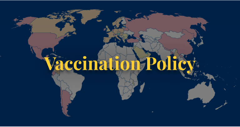
This interactive chart maps government policies on COVID-19 vaccination. Note that this only tracks policies on the availability of vaccinations. It does not track the number of people who have been vaccinated.
Countries are grouped into six categories:
- No availability
- Availability for ONE of following: key workers/ clinically vulnerable groups / elderly groups
- Availability for TWO of following: key workers/ clinically vulnerable groups / elderly groups
- Availability for ALL of following: key workers/ clinically vulnerable groups / elderly groups
- Availability for all three plus partial additional availability (select broad groups/ages)
- Universal availability
Income support
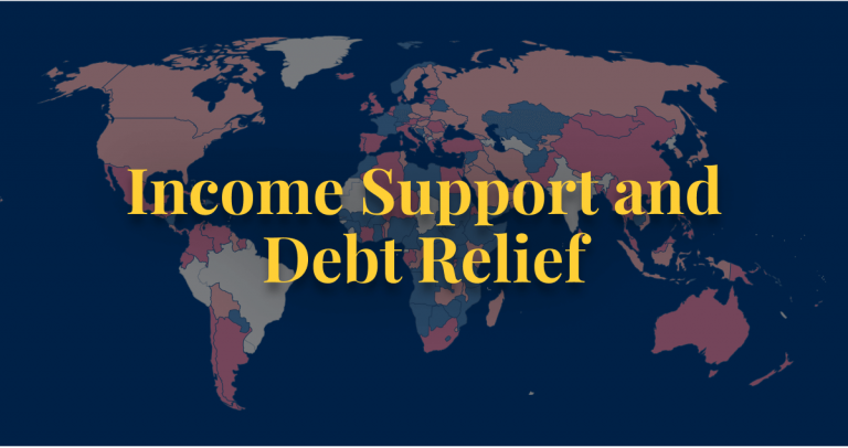
This interactive chart maps which governments provide income support to workers during the COVID-19 pandemic.
Debt and contract relief
This interactive chart maps which governments provide debt or contract relief to citizens during the COVID-19 pandemic.
To tackle the Coronavirus pandemic, countries across the world have implemented a range of stringent policies, including stay-at-home ‘lockdowns‘; school and workplace closures; cancellation of events and public gatherings; and restrictions on public transport.
These measures were implemented to slow the spread of the virus by enforcing physical distance between people.
How effective have these policies been in reducing human movement? What impact has it had on how people across the world work; live; and where they visit?
We can get some insights on this from the data that Google presents in its COVID-19 Community Mobility Reports. Using anonymized data provided by apps such as Google Maps, the company has produced a regularly updated dataset that shows how peoples’ movements have changed throughout the pandemic.1
This dataset from Google measures visitor numbers to specific categories of location (e.g. grocery stores; parks; train stations) every day and compares this change relative to baseline days before the pandemic outbreak. Baseline days represent a normal value for that day of the week and are given as the median value over the five‑week period from January 3rd to February 6th 2020. Measuring it relative to a normal value for that day of the week is helpful because people obviously often have different routines on weekends versus weekdays.
On Google’s website the data is only visualized in pdfs – one for each country. We present Google’s data in interactive charts below to make it easier to see changes over time in a given country; and how specific policies may have affected (or not) behavior across communities. Google notes that we should avoid comparing across regions or countries; this is because there may be local differences in categories which could be misleading.
We should also emphasise that change in visitors is measured relative to the baseline period between January and February 2020. This means changes in movement do not take account of seasonal variation – for example, we might expect visitors to parks or outdoor spaces to be higher during the summer. The data may therefore reflect some changes in seasonal movements, rather than being fully explained by changes due to the pandemic.
The amount of day-to-day variability in the raw data can make it difficult to understand how overall movements are changing over time. To make this easier to understand, we have converted the raw data into the seven-day rolling average. This is what is shown in the data in the following charts.
Change in visitors by category
This interactive chart shows how the number of visitors (or time spent) in categorized places has changed compared to baseline days (the median value for the 5‑week period from January 3 to February 6, 2020).
The ‘Residential’ category shows a change in duration of time spent at home—the other categories measure a change in total visitors.
This index is smoothed to the rolling 7-day average.
With the Change country option in the bottom left corner you can switch to another country.
To keep in mind when trying to understand these trends
Google provide clear guidance on how to read this data, and what should and shouldn’t be inferred from it. Some key points:
- The Residential category is measured in different units (duration rather than visitors) so you shouldn’t compare this change with other categories.
- People already spend a lot of time at home, so changes in Residential are likely to be smaller.
- Visits to Parks and outdoor spaces are highly influenced by weather and holidays – we would expect larger spikes in this category.
- Gaps in a specific time series occur when the quantity of data is too low to meet data quality and anonymity standards – don’t interpret this as zero change in visitors.
- Avoid comparing day-to-day changes. Especially weekends with weekdays.
- Avoid comparing levels across countries or regions. Regions can have local differences in the data which might mislead.
Retail and recreation
This interactive chart shows how the number of visitors to places of retail and recreation has changed compared to baseline days (the median value for the 5‑week period from January 3 to February 6, 2020).
This includes places like restaurants, cafes, shopping centers, theme parks, museums, libraries, and movie theaters.
This index is smoothed to the rolling 7-day average.
Three tips on how to interact with this map
- By clicking on any country on the map you see the change over time in this country.
- By moving the time slider (below the map) you can see how the global situation has changed over time.
- You can focus on a particular world region using the dropdown menu to the top-right of the map.
Grocery and pharmacy stores
This interactive chart shows how the number of visitors to grocery and pharmacy stores has changed compared to baseline days (the median value for the 5‑week period from January 3 to February 6, 2020).
This includes places like grocery markets, food warehouses, farmers markets, specialty food shops, drug stores, and pharmacies.
This index is smoothed to the rolling 7-day average.
Public transport stations
This interactive chart shows how the number of visitors to transit stations has changed compared to baseline days (the median value for the 5‑week period from January 3 to February 6, 2020).
This includes public transport hubs such as subway, bus, and train stations.
This index is smoothed to the rolling 7-day average.
Parks and outdoor spaces
This interactive chart shows how the number of visitors to parks and outdoor spaces has changed compared to baseline days (the median value for the 5‑week period from January 3 to February 6, 2020).
This includes places like local parks, national parks, public beaches, marinas, dog parks, plazas, and public gardens.
This index is smoothed to the rolling 7-day average.
To keep in mind when interpreting this data:
As Google notes in its guidance on understanding this dataset:
- In many regions, the data for Parks and outdoor spaces is spiky – this represents large day-to-day changes. This is because visitors to parks are heavily influenced by the weather and holidays.
- Since park visits are normally highly variable, you should expect more dramatic changes.
Workplace visitors
This interactive chart shows how the number of visitors to workplaces has changed compared to baseline days (the median value for the 5‑week period from January 3 to February 6, 2020).
This index is smoothed to the rolling 7-day average.
Time spent at home
This interactive chart shows how the number of visitors to residential areas has changed compared to baseline days (the median value for the 5‑week period from January 3 to February 6, 2020).
This index is smoothed to the rolling 7-day average.
To keep in mind when interpreting this data:
As Google notes in its guidance on understanding this dataset:
- The Residential category shows a change in duration—the other categories measure a change in total visitors. You should therefore be careful in making comparisons to other categories.
- People already spend a lot of time at home (even on workdays), we’d generally expect smaller changes than in other categories.


