Life expectancy is the key metric for assessing population health. Broader than the narrow metric of the infant and child mortality, which focus solely at mortality at a young age, life expectancy captures the mortality along the entire life course. It tells us the average age of death in a population.
Estimates suggest that in a pre-modern, poor world, life expectancy was around 30 years in all regions of the world.
Life expectancy has increased rapidly since the Age of Enlightenment. In the early 19th century, life expectancy started to increase in the early industrialized countries while it stayed low in the rest of the world. This led to a very high inequality in how health was distributed across the world. Good health in the rich countries and persistently bad health in those countries that remained poor. Over the last decades this global inequality decreased. No country in the world has a lower life expectancy than the countries with the highest life expectancy in 1800. Many countries that not long ago were suffering from bad health are catching up rapidly.
Since 1900 the global average life expectancy has more than doubled and is now above 70 years. The inequality of life expectancy is still very large across and within countries. in 2019 the country with the lowest life expectancy is the Central African Republic with 53 years, in Japan life expectancy is 30 years longer.
Related research:
Why do women live longer than men? by Esteban Ortiz-Ospina
Interactive charts on Life Expectancy
Differences in life expectancy across the world
The world map shows the latest data published by the United Nations for life expectancy.
Life expectancy is a measure of premature death and it shows large differences in health across the world.
The population of many of the richest countries in the world have life expectancies of over 80 years. In 2019 the life expectancy in Spain, Switzerland, Italy, and Australia was over 83 years. In Japan it was the highest with close to 85 years.
In the countries with the worst health life expectancy is between 50 and 60 years. The population of the Central African Republic has the lowest life expectancy in 2019 with 53 years.
Use the slider below the map to see the change over time or click on any country to see the changing of life expectancy around the world.
OECD Data: Life Expectancy at birth
UN WPP Data: Life expectancy
Twice as long – life expectancy around the world
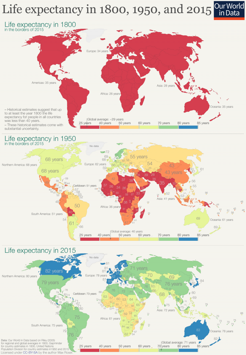
The three maps show the global history of life expectancy over the last two centuries.1
Demographic research suggests that at the beginning of the 19th century no country in the world had a life expectancy longer than 40 years.2 Every country is shown in red. Almost everyone in the world lived in extreme poverty, we had very little medical knowledge, and in all countries our ancestors had to prepare for an early death.
Over the next 150 years some parts of the world achieved substantial health improvements. A global divide opened. In 1950 the life expectancy for newborns was already over 60 years in Europe, North America, Oceania, Japan and parts of South America. But elsewhere a newborn could only expect to live around 30 years. The global inequality in health was enormous in 1950: People in Norway had a life expectancy of 72 years, whilst in Mali this was 26 years. Africa as a whole had an average life expectancy of only 36 years, while people in other world regions could expect to live more than twice as long.
The decline of child mortality was important for the increase of life expectancy, but as we explain in our entry on life expectancy increasing life expectancy was certainly not only about falling child mortality – life expectancy increased at all ages.
Such improvements in life expectancy — despite being exclusive to particular countries — was a landmark sign of progress. It was the first time in human history that we achieved sustained improvements in health for entire populations.3 After millennia of stagnation in terrible health conditions the seal was finally broken.
Now, let’s look at the change since 1950. Many of us have not updated our world view. We still tend to think of the world as divided as it was in 1950. But in health — and many other aspects — the world has made rapid progress. Today most people in the world can expect to live as long as those in the very richest countries in 1950. The United Nations estimate a global average life expectancy of 72.6 years for 2019 – the global average today is higher than in any country back in 1950. According to the UN estimates the country with the best health in 1950 was Norway with a life expectancy of 72.3 years.
The three maps summarize the global history of life expectancy over the last two centuries: Back in 1800 a newborn baby could only expect a short life, no matter where in the world it was born. In 1950 newborns had the chance of a longer life if they were lucky enough to be born in the right place. In recent decades all regions of the world made very substantial progress, and it were those regions that were worst-off in 1950 that achieved the biggest progress since then. The divided world of 1950 has been narrowing.
Globally the life expectancy increased from less than 30 years to over 72 years; after two centuries of progress we can expect to live much more than twice as long as our ancestors. And this progress was not achieved in a few places. In every world region people today can expect to live more than twice as long.
The global inequalities in health that we see today also show that we can do much better. The almost unbelievable progress the entire world has achieved over the last two centuries should be encouragement enough for us to realize what is possible.
Life expectancy in 1800, 1950, and 20154
Life expectancy has improved globally
This visualization shows the dramatic increase in life expectancy over the last few centuries as a line chart. For the UK – the country for which we have the longest time-series – we see that before the 19th century there was no trend for life expectancy: life expectancy fluctuated between 30 and 40 years.
Over the last 200 years people in all countries in the world achieved impressive progress in health that lead to increases in life expectancy. In the UK, life expectancy doubled and is now higher than 80 years. In Japan health started to improve later, but the country caught up quickly with the UK and surpassed it in the late 1960s. In South Korea health started to improve later still and the country achieved even faster progress than the UK and Japan; by now life expectancy in South Korea has surpassed life expectancy in the UK.
The chart also shows how low life expectancy was in some countries in the past: A century ago life expectancy in India and South Korea was as low as 23 years. A century later, life expectancy in India has almost tripled and in South Korea it has almost quadrupled.
You can switch to the map view to compare life expectancy across countries. This view shows that there are still huge differences between countries: people in many Sub-Saharan countries have a life expectancy of less than 60 years, while in Japan it exceeds 80.
Rising life expectancy around the world
In the pre-modern, poor world life expectancy was around 30 years in all regions of the world. The estimates by historian James Riley shown here suggest that there was some variation, between different world regions, but in all world regions life expectancy was well below 40 years.5
The historical estimates are associated with a considerable uncertainty – it is worth reading the work by Riley to understand the limitations and strengths of the estimates.6 But of course these uncertainties are much smaller than the very large increase in life expectancy since then.
Infectious diseases raged in all parts of the world and as we show in our entry on child mortality almost half of all children died before they reached adulthood. And those that survived often died soon after. Without public health measures and without effective medicines diseases were killing most people at a very young age.
This was the reality for humanity until very recently. Life expectancy in each region of the world stayed fairly stable for most of history until humanity started to make progress against poor health just a few generations ago. Epidemiologists refer to this period in which life expectancy began to increase substantially as the “health transition”.
This chart shows that the health transition began at different times in different world regions; Oceania began to see increases in life expectancy around 1870, while Africa didn’t begin to see increases until around 1920.
Since then life expectancy doubled in all world regions.
- In Oceania life expectancy increased from 35 years before the health transition to 79 years in 2019.
- In Europe from 34 to 79 years.
- In the Americas from 35 to 77 years.
- In Asia from 27.5 to 73.6.
- And in Africa from 26 years to 63 years.
Globally the life expectancy increased from an average of 29 to 73 years in 2019.
Life expectancy increased in all countries of the world
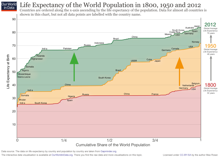
There is a lot of information in the following – rather unusual – chart. On the x-axis you find the cumulative share of the world population. And all the countries of the world are ordered along the x-axis ascending by the life expectancy of the population. On the y-axis you see the life expectancy of each country.
For 1800 (red line) you see that the countries on the left – India and also South Korea – have a life expectancy around 25. On the very right you see that in 1800 no country had a life expectancy above 40 (Belgium had the highest life expectancy with just 40 years).
In 1950 the life expectancy of all countries was higher than in 1800 and the richer countries in Europe and North America had life expectancies over 60 years – over the course of modernization and industrialization the health of the population improved dramatically. But half of the world’s population – look at India and China – made only little progress. Therefore the world in 1950 was highly unequal in living standards – clearly devided between developed countries and developing countries.
This division is ending: Look at the change between 1950 and 2012! Now it is the former developing countries – the countries that were worst off in 1950 – that achieved the fastest progress. While some countries (mostly in Africa) are lacking behind. But many of the former developing countries have caught up and we achieved a dramatic reduction of global health inequality.
The world developed from equally poor health in 1800 to great inequality in 1950 and back to more equality today – but equality on a much higher level.
How to read the following graph: On the x-axis you find the cumulative share of the world population. The countries are ordered along the x-axis ascending by the life expectancy of the population.
Life expectancy of the world population, 1800, 1950 and 20127
It is not only about child mortality – life expectancy by age
It’s often argued that life expectancy across the world has only increased because child mortality has fallen. If this were true, this would mean that we’ve become much better at preventing young children from dying, but have achieved nothing to improve the survival of older children, adolescents and adults. Once past childhood, people would be expected to enjoy the same length of life as they did centuries ago.
This, as we will see in the data below, is untrue. Life expectancy has increased at all ages. The average person can expect to live a longer life than in the past, irrespective of what age they are.
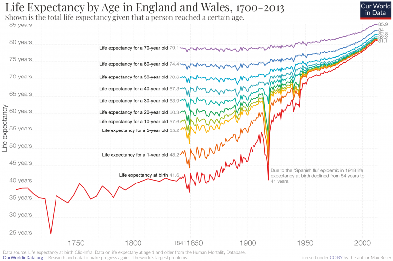
The visualization shows the life expectancy in England and Wales over the last three centuries.
The red line shows the life expectancy for a newborn. Until the mid-19th century a newborn could expect to live around 40 years. At times, even less.
The rainbow-colored lines show how long a person could expect to live once they had reached that given, older, age. The light green line, for example, represents the life expectancy for children who had reached age 10.
The most striking development we see is the dramatic increase in life expectancy since the mid-19th century. Life expectancy at birth doubled from around 40 years to more than 81 years.8 This achievement was not limited to England and Wales; since the late 19th century life expectancy doubled across all regions of the world.
While England and Wales are not the only region that achieved this improvement, the last 150 years are the only time that humanity achieved anything like this. The evidence that we have for population health before modern times suggest that around a quarter of all infants died in the first year of life and almost half died before they reached the end of puberty (see here) and there was no trend for life expectancy before the modern improvement in health: In the centuries preceding this chart, life expectancy fluctuated between 30 and 40 years with no marked increase ever.
Life expectancy increased at all ages
A common criticism of the statement that life expectancy doubled is that this “only happened because child mortality declined”. I think that, even if this were true, it would be one of humanity’s greatest achievements, but in fact, this assertion is also just plain wrong. Mortality rates declined, and consequently life expectancy increased, for all age groups.
The data shown in this chart makes this clear.
Let’s see how life expectancy has improved without taking the massive improvements in child mortality into account. Child mortality is defined as the share of children who die before reaching their 5th birthday. We therefore have to look at the life expectancy of a five-year-old to see how mortality changed without taking child mortality into account. This is shown by the yellow line. In 1841 a five-year-old could expect to live 55 years. Today a five-year-old can expect to live 82 years. An increase of 27 years.
The same is true for any higher age cut-off. A 50-year-old, for example, could once expect to live up to the age of 71. Today, a 50-year-old can expect to live to the age of 83. A gain of 13 years.
This is true for countries around the world. Here is the data for the life expectancy of 15-year-olds around the world.
A second striking feature of this visualization is the big decline of life expectancy in 1918. It was caused by a very large global influenza epidemic, the Spanish flu pandemic. I have studied the impact of this pandemic and especially it’s differential impact for different age-groups – the life expectancy of older people barely changed as the chart shows – in a text on the this pandemic here.
Yes, the decline of child mortality matters a lot for life expectancy. But as we’ve seen, the gains go much further than this. As we have seen here it was not only children that benefited from this progress, but people at all ages.
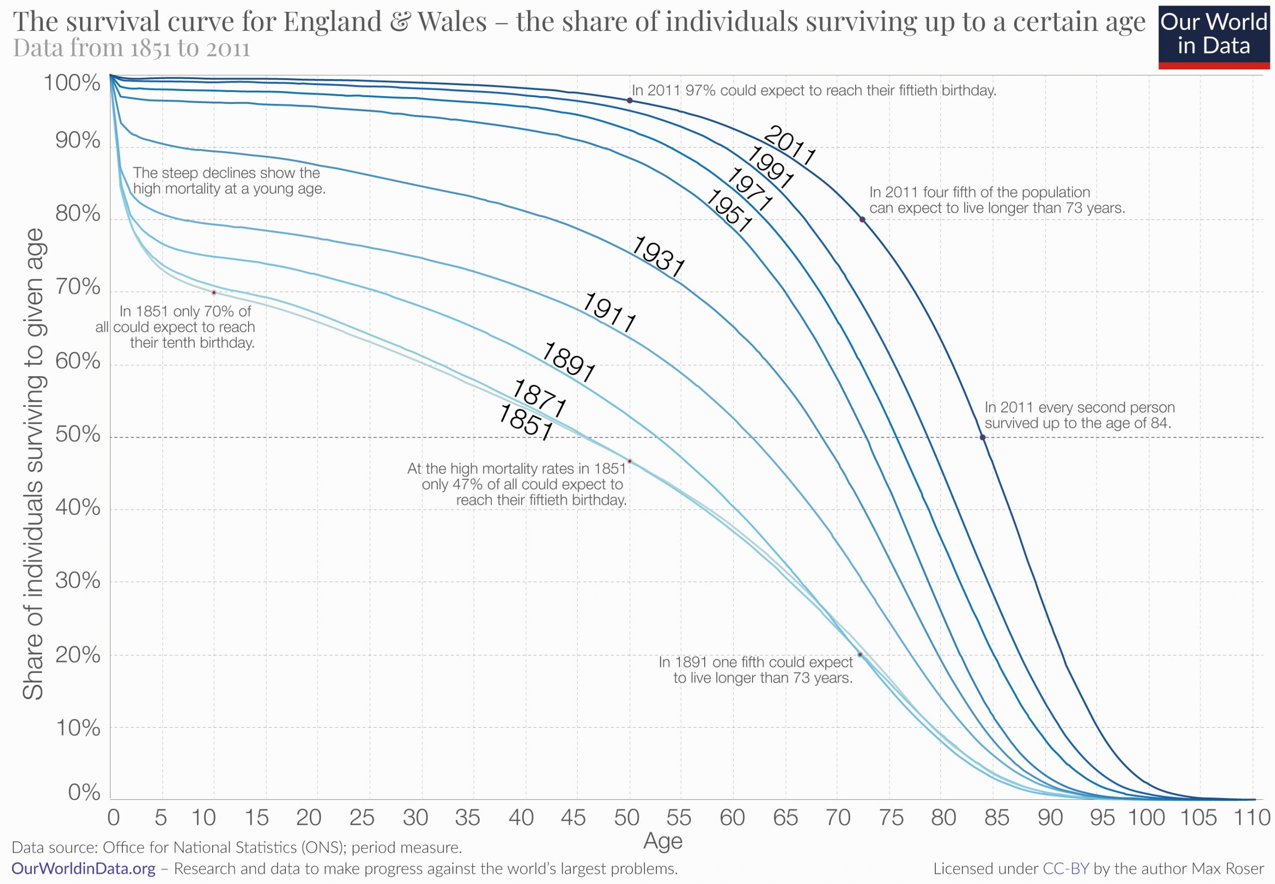
‘Population survival curves’ show the share of people who are expected to survive up to a certain age. The chart here plots the survival curves for individuals in England and Wales from 1851 up to 2011.
As we can see, less than half of the people born in the mid-19th century made it past their 50th birthday. In contrast, 97% of the people born in England and Wales today can expect to live longer than 50 years.
Life expectancy estimates only describe averages, these curves therefore provide an important complementary view and help us understand how the inequality of life lengths has changed over time. In the 19th century the inequality was very large, many died at a very young age and a considerable number of people died between the age of 5 and 60. Today the inequality is much lower, the huge majority survives the first 60 or 70 years of their life and the span at which most people die is much more compressed than it was 150 years ago.
Related chart: Deaths by age group in England and Wales
This map shows the share of the population that is expected to survive to the age of 65.
Related chart: Share that is expected to survive to the age of 65, by sex
The following visualization shows the estimates and UN-projections of the remaining expected life years for 15-year-olds. The rise – best visible on the Map-view – shows that the increasing life expectancy is not only due to declining child mortality, but that mortality rates at higher ages also declined globally.
In this chart we see the breakdown of deaths by age bracket. Globally fewer and fewer people die at a young age.
In 2017, there were 56.5 million deaths globally; just over half of these were people who were 70 years or older; 26% were between 50 and 69 years old; 13% were between 15 and 49; only 1% were older than 5 and younger than 14; and almost 9% were children under the age of 5.
The age at which people die has changed significantly since 1990. Fewer people die at a young age. In 1990 nearly one-quarter of all deaths were in children younger than 5. In 2019, this had declined to just under 9%. In contrast, the share of deaths in the over-70s age bracket has increased from a third to half of all deaths over this period.
It is possible to change this chart to any other country or region in the world. In countries with good health the share dying at a young age is very low. In Japan more than 85% are 70 years or older.
Inequality of life expectancy
The inequality in years of life between people within the same country can be measured in the same way that we measure, for example, the inequality in the distribution of incomes. The idea is to estimate the extent to which a small share of a country’s population concentrates a large ‘stock of health’, hence living much longer than most of the population in the same country.
The following visualization presents estimates of the inequality of lifetimes as measured by the Gini coefficient. A high Gini coefficient here means a very unequal distribution of years of life – that is, large within-country inequalities of the number of years that people live. These estimates are from Peltzman (2009)9, where you can find more details regarding the underlying sources and estimation methodology.
As can be seen in the chart, inequality in health outcomes has fallen strongly within many countries.
In every country the life expectancy of women is higher than the life expectancy of men as this chart shows.
Why this is the case is answered by Esteban Ortiz-Ospina in his text Why do women live longer than men?
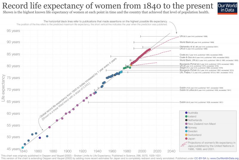
The following graph is an updated version of the graph in the paper ‘Broken Limits to Life Expectancy‘ published in Science by Oeppen and Vaupel in 2002.10
It shows quite a lot of information:
- The colored symbols represent the highest life expectancy of women from 1840 to today – indicating that country with the highest life expectancy at each point in time. For instance, we can see that in the mid-1800s, Norway had the highest life expectancy, but then by 1880 people in non-Maori New Zealand were expected to live the longest lives. The data shows that in the life expectancy in the leading country of the world has increased by three months every single year.
- The solid horizontal line represents the results of the linear regression on all these points; remarkably, the maximum life expectancy seems to follow this linear trend very closely. The gray dashed line is the extension of this trend into the future, and the red dashed lines represent ‘projections of female life expectancy in Japan published by the UN in 1986, 1999, and 2001.’
- The author names listed on the right refer to multiple predictions of the maximum possible life expectancy for humans. The horizontal black lines extending from the publication denote the prediction in each publication of the asserted ceiling on life expectancy attainable by humans and the year in which the study was published. Dublin published a study in 1928 that asserted that the maximum life expectancy possible was less than 65 while at the same time life expectancy in New Zealand was already over 65. The predictions of maximum life expectancy were proven wrong again and again over the course of the last century. On average the predictions have been broken within 5 years after publication.
Record female life expectancy including time trend and asserted ceilings on life expectancy, 1840 to the present11
As prior visualizations in this entry have shown, life expectancy has been rising globally. However, this can be broken down further into ‘healthy life expectancy’ and ‘years lived with disability’. This breakdown in shown in this chart.
It is true that there has been an increase for most countries in both aspects. Healthy life expectancy has increased across the world (in some countries, significantly in recent decades). It is also true that improved healthcare and treatments have also increased the number of years, on average, in which people live with a given disease burden or disability. This increase has, in most cases, been slower than the increase of healthy life expectancy.
The map shows the expected years lived with disability across the world. In general, we tend to see that higher-income countries tend to spend more years with disability or disease burden than at lower incomes (around 10-11 years versus 7-9 years at lower incomes).
The scatter plot shows that in countries where the life expectancy is highest the expected years lived with disability or disease tend to be the longest too.
Median age by country
The median age of a country’s population is an indicator of demographic makeup of the country and of its the population growth. This chart shows how the world population is aging; the median age is increasing around the world. However, there are considerable differences between world regions – many parts of sub-Saharan Africa are much younger since both birth rates and mortality are higher.
Many aspects had to change for life expectancy to double. It is helpful therefore to read our entries on all the many causes of death, from infectious diseases like smallpox and malaria to non-communicable diseases like cancer. Not just specific medical innovations, like vaccinations or antibiotics, were necessary, but also public health interventions – improved public sanitation and publicly funded healthcare – were crucial.
Below we are looking at several aspects, but this section is not yet complete and we will work on it in the future.
How strong is the link between healthcare expenditure and life expectancy?
One of the most important inputs to health is healthcare. Here we study cross-country evidence of the link between aggregate healthcare consumption and production, and health outcomes.
One common way of measuring national healthcare consumption and production is to estimate aggregate expenditure on healthcare (typically expressed as a share of national income).
This visualization shows the cross-country relationship between life expectancy at birth and healthcare expenditure per capita.
The chart shows the level of both measures at two points in time, about a generation apart (1995 and 2014 respectively). The arrows connect these two observations, thereby showing the change over time of both measures for all countries in the world. As it can be seen, countries with higher expenditure on healthcare per person tend to have a higher life expectancy. And looking at the change over time, we see that as countries spend more on health, life expectancy of the population increases.
Notice that the relationship in this chart seems to follow a pattern of ‘diminishing returns’: the increase in life expectancy associated with an increase in healthcare expenditure decreases as expenditure increases. This means the proportional highest gains are achieved in poor countries with low baseline levels of spending. This pattern is similar to that observed between life expectancy and per capita income.
The countries are color-coded by world region, as per the inserted legends. Many of the green countries (Sub-Saharan Africa) achieved remarkable progress over the last 2 decades: health spending often increased substantially and life expectancy in many African countries increased by more than 10 years. The most extreme case is Rwanda, where life expectancy has increased from 32 to 64 years since 1995 — which was one year after the Rwandan genocide. The graph also shows that the African countries that suffered the most under the HIV/AIDS epidemic — Lesotho, Eswatini, and South Africa — experienced a decline of life expectancy from which they have not yet recovered.
The two most populous countries of the world – India and China – are emphasized by larger arrows. It is interesting to see that in 1995 China achieved already relatively good health outcomes at comparatively low levels of health spending.
The association between health spending and increasing life expectancy also holds for rich countries in Europe, Asia, and North America in the upper right corner of the chart. The US is an outlier that achieves only a comparatively short life expectancy considering the fact that the country has by far the highest health expenditure of any country in the world.
Earlier in this entry we explored the breakdown of total life expectancy between ‘healthy life expectancy’ and ‘years lived with disability or disease burden’. In this chart we see the relationship between years lived with disability or disease burden versus average per capita health expenditure. Here we see a positive correlation whereby countries with higher healthcare expenditure tend to live more years with disability or disease burden. This is likely to result from increased healthcare resourcing in general care and treatment (allowing for an extension of life with a given illness or disability).
Better science and better health
David Cutler, Angus Deaton, and Adriana Lleras-Muney12 write: “Knowledge, science and technology are the keys to any coherent explanation. Mortality in England began to decline in the wake of the Enlightenment, directly through the application to health of new ideas about personal health and public administration, and indirectly through increased productivity that permitted (albeit with some terrible reversals) better levels of living, better nutrition, better housing and better sanitation. Ideas about the germ theory of disease were critical to changing both public health infrastructure and personal behavior. Similarly, knowledge about the health effects of smoking in the middle of the twentieth century has had profound effects on behavior and on health. Most recently, the major life-saving scientific innovations in medical procedures and new pharmaceuticals have had a major effect, particularly on reduced mortality from cardiovascular disease. There have also been important health innovations whose effect has been mainly in poor countries: for example, the development of freeze-dried serums that can be transported without refrigeration, and of oral rehydration therapy for preventing the death of children from diarrhea.”
Life expectancy and GDP
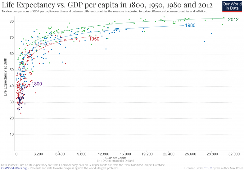
This graph displays the correlation between life expectancy and gross domestic product (GDP) per capita. It shows that In general, countries with higher GDP tend to have a higher life expectancy. It is a logarithmic relationship: the difference in life expectancy per difference in GDP per capita is higher for poorer than for richer countries.
The cross-sectional relationship between life expectancy and per capita income is known as the Preston Curve, named after Samuel H. Preston who first described it in a famous paper from 1975.13
In the chart we are plotting the cross-sectional relationship for the years 1800, 1950, 1980, and 2012. Interestingly we then find that the life expectancy associated with a given level of real income is rising over time. If economic development was the only determinant of health countries then we would see a steady relationship between the two metrics and the curve would not shift over time. Since this is not the case we can conclude that economic development cannot be the sole determinant of health. A possible explanation for this changing relationship is that scientific understanding and technological progress makes some very efficient public health interventions – such as vaccinations, hygiene measures, oral rehydration therapy, and public health measures – cheaper and brings these more and more into the reach of populations with lower and lower incomes.
The Preston curves below show the correlation between prosperity and life expectancy across countries. How did life expectancy change over time when countries got richer?
The historical research focuses on England as it is the country that first achieved economic growth and also the country for which we have the best long-run data.
The historical data for life expectancy in England shows clearly that life expectancy did not increase for much of the early period of British industrialization. According to the famous research by historian and Nobel laureate Robert Fogel living conditions for most people declined during the early period of industrialization. The debate about how living conditions changed then is still very much alive today,14 but what is clear however from this research is that rising prosperity itself is not sufficient to improvements in health. This is why our publication is so very broad and why we explain in our mission that “measuring economic growth is not enough” to understand whether we are making progress against the problems we are concerned with.
Related charts:
“Life expectancy” – what does this actually mean?
Life expectancy has doubled in all world regions. What does this mean exactly?
Despite its importance and prominence in research and policy, it is surprisingly difficult to find a simple yet detailed description of what “life expectancy” actually means. In this section, we try to fill this gap.
The term “life expectancy” refers to the number of years a person can expect to live. By definition, life expectancy is based on an estimate of the average age that members of a particular population group will be when they die.
In practice, however, things are often more complicated:
One important distinction and clarification is the difference between cohort and period life expectancy.
The cohort life expectancy is the average life length of a particular cohort – a group of individuals born in a given year. When we can track a group of people born in a particular year, many decades ago, and observe the exact date in which each one of them died then we can calculate this cohort’s life expectancy by simply calculating the average of the ages of all members when they died.
You can think of life expectancy in particular year as the age a person born in that year would expect to live if the average age of death did not change over their lifetime.
It is of course not possible to know this metric before all members of the cohort have died. Because of that statisticians commonly track members of a particular cohort and predict the average age-at-death for them using a combination of observed mortality rates for past years and projections about mortality rates for future years.
An alternative approach consists in estimating the average length of life for a hypothetical cohort assumed to be exposed, from birth through death, to the mortality rates observed at one particular period – commonly a year. This approach leads to what is known as ‘period life expectancy‘ and it is the much more commonly used life expectancy metric. It is the definition used by most international organizations, including the UN and the World Bank, when reporting ‘life expectancy’ figures. Period life expectancy estimates do not take into account how mortality rates are changing over time and instead only reflects the mortality pattern at one point in time. Because of this, period life expectancy figures are usually different to cohort life expectancy figures.
Since period life expectancy estimates are ubiquitous in research and public debate, it is helpful to use an example to flesh out the concept. Let’s consider the map showing life expectancy—specifically period life expectancy—at birth in 2005. You can hover the mouse over a country to display the corresponding estimate.
For Japan, we can see that life expectancy in 2005 was 82.3 years. This means that a hypothetical cohort of infants living through the age-specific mortality of Japan in 2005 could expect to live 82.3 years, under the assumption that mortality patterns observed in 2005 remain constant throughout their lifetime. But if life expectancies are increasing the reality for a cohort born then is that the cohort life expectancy is higher than that period life expectancy. We see this in the data: if you move the slider below the map forward, you’ll see that in 2019 the period life expectancy in Japan was 84.6 years, which means that mortality patterns in Japan did improve in the period 2005-2019.
In general, the commonly-used period life expectancies tend to be lower than the cohort life expectancies, because mortality rates were falling over the course of modern development. Whenever mortality rates are falling then the period life expectancy is lower than the life expectancy of the cohort born then
An important point to bear in mind when interpreting life expectancy estimates is that very few people will die at precisely the age indicated by life expectancy, even if mortality patterns stay constant.
For example, very few of the infants born in South Africa in 2009 will die at 52.2 years of age, as per the figures in the map above. Most will die much earlier or much later, since the risk of death is not uniform across the lifetime. Life expectancy is the average.
In societies with high infant mortality rates many people die in the first few years of life; but once they survive childhood, people often live much longer. Indeed, this is a common source of confusion in the interpretation of life expectancy figures: It is perfectly possible that a given population has a low life expectancy at birth, and yet has a large proportion of old people.
Given that life expectancy at birth is highly sensitive to the rate of death in the first few years of life, it is common to report life expectancy figures at different ages, both under the period and cohort approaches. For example, the UN estimates that the (period) global life expectancy at age 15 in 2005 was 73.6 years. This means that the group of 15-year-old children alive around the world in 2005 could expect to live another 63.6 years (i.e. until the age of 73.6), provided that mortality patterns observed in 2005 remained constant throughout their lifetime.
Finally, another point to bear in mind is that period and cohort life expectancy estimates are statistical measures, and they do not take into account any person-specific factors such as lifestyle choices. Clearly, the length of life for an average person is not very informative about the predicted length of life for a person living a particularly unhealthy lifestyle.
How is life expectancy calculated?
In practical terms, estimating life expectancy entails predicting the probability of surviving successive years of life, based on observed age-specific mortality rates. How is this actually done?
Age-specific mortality rates are usually estimated by counting (or projecting) the number of age-specific deaths in a time interval (e.g. the number of people aged 10-15 who died in the year 2005), and dividing by the total observed (or projected) population alive at a given point within that interval (e.g. the number of people aged 10-15 alive on 1 July 2015).
To ensure that the resulting estimates of the probabilities of death within each age interval are smooth across the lifetime, it is common to use mathematical formulas, to model how the force of mortality changes within and across age intervals. Specifically, it is often assumed that the proportion of people dying in an age interval starting in year
Once we have estimates of the fraction of people dying across age intervals, it is simple to calculate a ‘life table’ showing the evolving probabilities of survival and the corresponding life expectancies by age. Here is an example of a life table from the US, and this tutorial from MEASURE Evaluation explains how life tables are constructed, step by step (see Section 3.2 ‘The Fergany Method’).
Period life expectancy figures can be obtained from ‘period life tables’ (i.e. life tables that rely on age-specific mortality rates observed from deaths among individuals of different age groups at a fixed point in time). And similarly, cohort life expectancy figures can be obtained from ‘cohort life tables’ (i.e. life tables that rely on age-specific mortality rates observed from tracking and forecasting the death and survival of a group of people as they become older).
For some countries and for some time intervals, it is only possible to reconstruct life tables from either period or cohort mortality data. As a consequence, in some instances—for example in obtaining historical estimates of life expectancy across world regions—it is necessary to combine period and cohort data. In these cases, the resulting life expectancy estimates cannot be simply classified into the ‘period’ or ‘cohort’ categories.
What else can we learn from ‘life tables’?
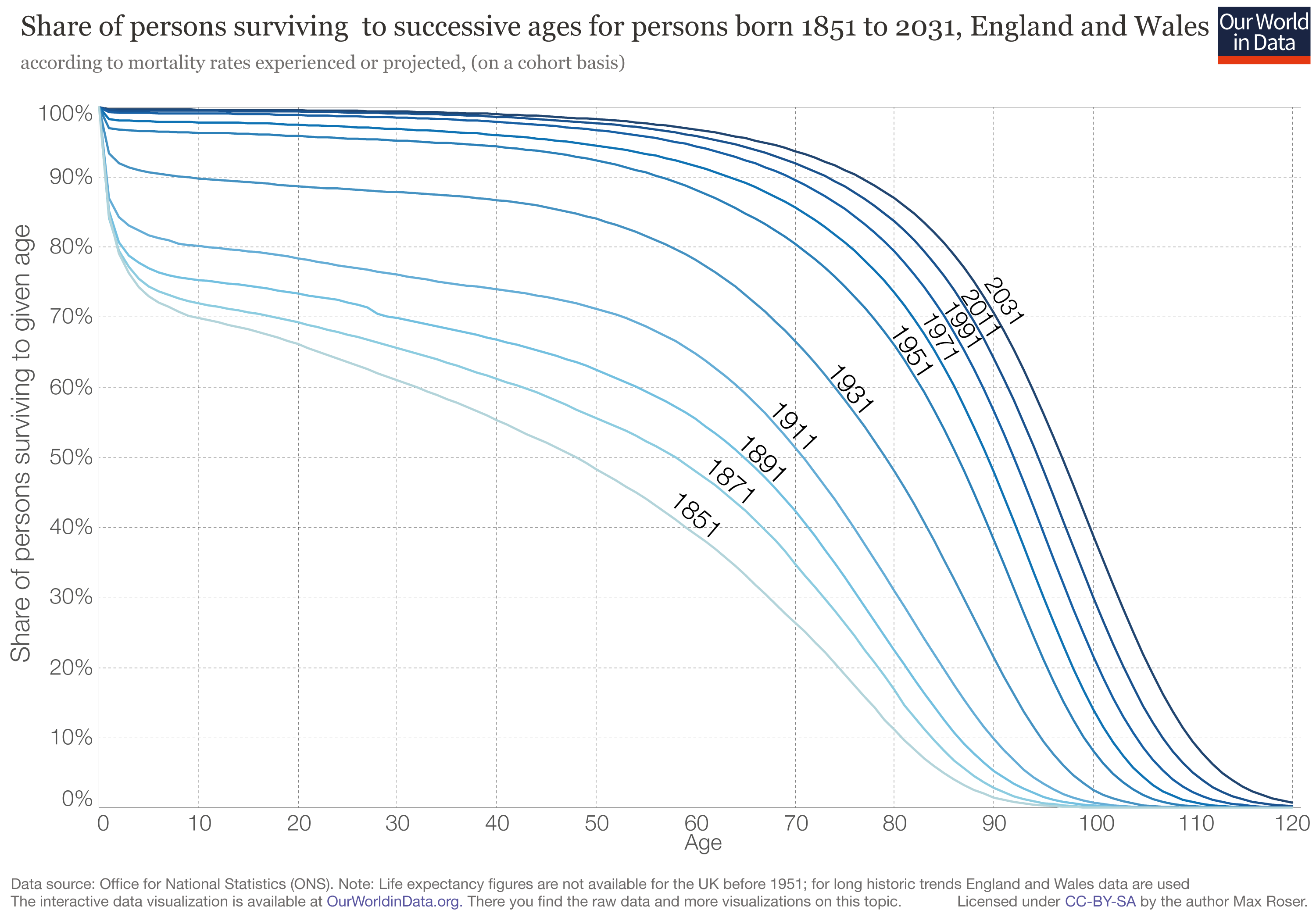
Life tables are not just instrumental to the production of life expectancy figures (as noted above), they also provide many other perspectives on the mortality of a population. For example, they allow for the production of ‘population survival curves’, which show the share of people who are expected to survive various successive ages. This chart provides an example, plotting survival curves for individuals born at different points in time, using cohort life tables from England and Wales.
At any age level in the horizontal axis, the curves in this visualization mark the estimated proportion of individuals who are expected to survive that age. As we can see, less than half of the people born in 1851 in England and Wales made it past their 50th birthday. In contrast, more than 95% of the people born in England and Wales today can expect to live longer than 50 years.
Since life expectancy estimates only describe averages, these indicators are complementary, and help us understand how health is distributed across time and space. In our entry on Life Expectancy you can read more about related complementary indicators, such as the median age of a population.
- Long-run data on life expectancy at birth for the time period since 1800 is available from the Clio Infra project.
- Long-term data is available at Lifetable.de. Lifetable.de – a project by researchers at the Max Planck Institute in Rostock, the University of Berkeley and the Institut national d’études démographiques in Paris – presents life expectancy estimates drawn from some 700 sources. The estimates along with the sources are presented at lifetable.de.
- Gapminder presents estimates for life expectancy since 1800. Here is the corresponding documentation.
- Annual data on ‘Life expectancy at birth’ [by country] – since 1961 – is available in the World Development Indicators (WDI) published by the World Bank. For the male population, the female population and the total population.
- The World Health Organization (WHO) publishes data on life expectancy. Data are only available for the time after 1990.
- Other more specialized data are available in the The Human Mortality Database (free – but registration is necessary).
- The Eurostat website ‘Statistics Explained’ publishes up-to-date statistical information on mortality and life expectancy.
- Wikipedia includes a list of countries by life expectancy which includes up-to-date data from different sources.


