Authors of this work
This redesign project was built by Joe Hasell, Matthew Conlen, Marwa Boukarim, Matthieu Bergel, Ike Saunders, Daniel Bachler, Pablo Arriagada, and Max Roser.
At Our World in Data, we present data and research in a number of ways: as individual charts, data explorers that allow users to switch between metrics, technical articles that explain what particular metrics mean, and articles that explain what the data tells us about the world to make progress.
We have more than 3,000 interactive charts spanning hundreds of topics.
One of our biggest challenges has been bringing all of this data and research together in a way that users can navigate easily. People should be able to quickly find exactly what they’re looking for. And be able to find it again when they come back.
To help solve this challenge, over the past year, our product and engineering teams have been working on the design of a new format for collecting and presenting all our data, research, and writing on particular topics.
We’ve now published the first example of this redesign for one topic – Poverty.
We plan to progressively roll this design out across the other topics on our site in the next year.
What do we want to achieve with this redesign?
At Our World in Data, we strive to make data both easy to access and easy to understand. And we want to make the information that we’re presenting useful to a wide range of people, from the government official who wants to make a policy decision informed by the best available data to a curious reader who wants to understand what is going on in the world around them.
One of Our World in Data’s biggest contributions is that we provide important context – of methodological challenges, data quality, and key insights – to the data and research that we present. This redesign aims to make sure that these important insights and technical details are easily discoverable without overwhelming readers through information overload.
Our new topic pages seek to achieve this by adopting the structure of Ben Schneiderman’s Visual Information-Seeking Mantra, a tried and true approach to designing interactive, information-dense user interfaces: overview first, zoom and filter, then details-on-demand.
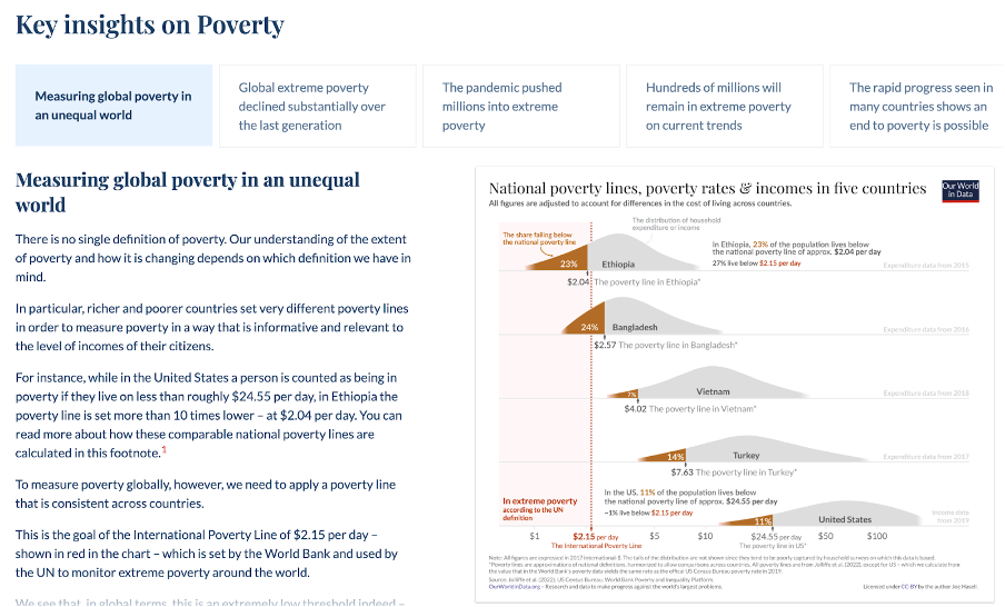
At the top of the new topic pages are key insights, a collection of the main takeaways of a given topic curated by expert authors for those that want an overview.
These insights combine data visualizations with short explanations that allow readers to quickly understand the most important aspects of the subject.

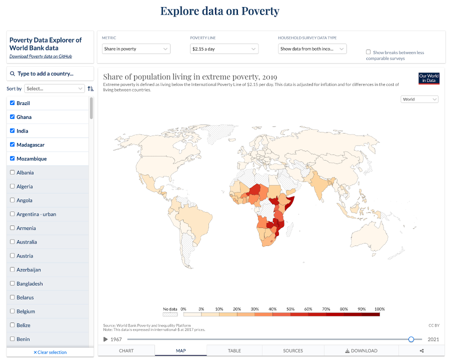
Next, interactive data explorers allow readers to engage with and manipulate the data, for example, by quickly switching between metrics and comparing countries.
These explorers enable readers to discover their own insights by filtering and zooming charts to find relevant subsets of the data and create the exact visualizations that they are looking for.

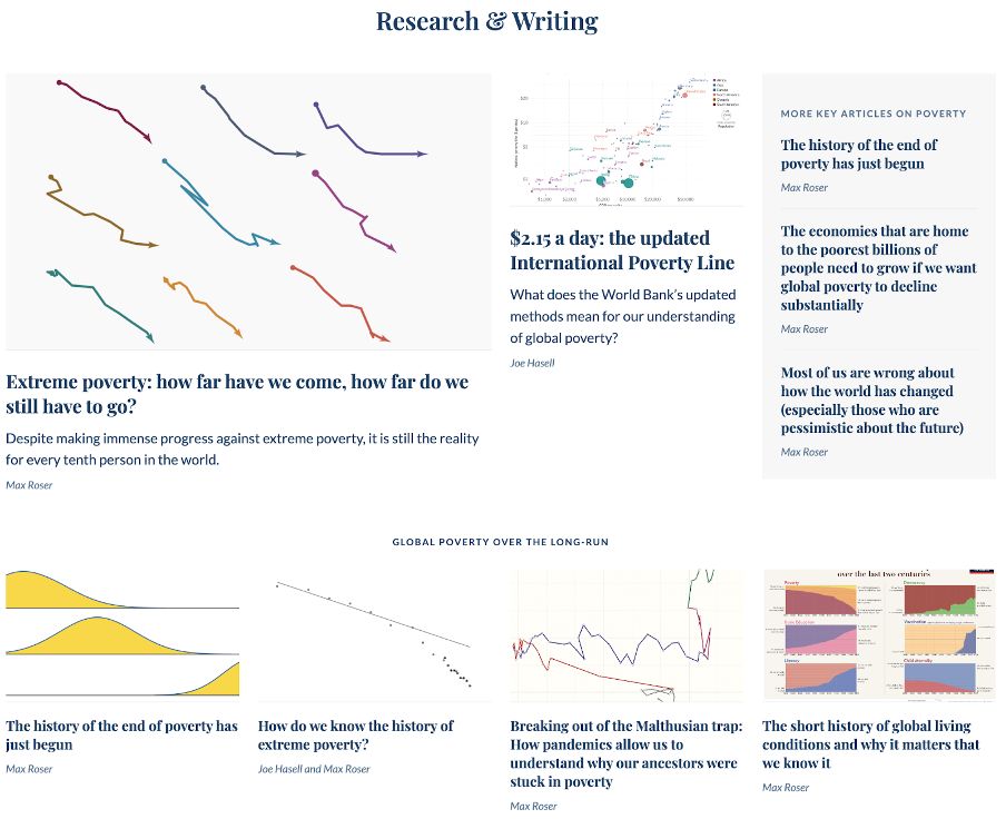
Finally, the most interested readers can dig into additional details: methodological explanations of the definitions of key metrics explain what they mean, and identify important points about data quality; a collection of research and writing provides links to in-depth articles that look at global problems and how we make progress on solutions; a visual gallery of charts provides quick navigation to all of the visualizations that we’ve made on the topic.

To continue to improve our work, we really appreciate your feedback on this new design. Do you find it easy to navigate? What do you find confusing? If you have comments or suggestions please get in touch at info@ourworldindata.org.


