The limits of our personal experience and the value of statistics
It’s tempting to believe that we can simply rely on personal experience to develop our understanding of the world. But that’s a mistake. The world is large, and we can experience only very little of it personally. To see what the world is like, we need to rely on other means: carefully-collected global statistics.
Of course, our personal interactions are part of what informs our worldview. We piece together a picture of the lives of others around us from our interactions with them. Every time we meet people and hear about their lives, we add one more perspective to our worldview. This is a great way to see the world and expand our understanding, I don’t want to suggest otherwise. But I want to remind ourselves how little we can learn about our society through personal interactions alone, and how valuable statistics are in helping us build the rest of the picture.
The horizon of our personal experience
How many people do you know personally?
Let’s take a broad definition of what it means to know someone and say that we include everyone you know by name. A study in the US asked how many people Americans know by name and found that the average person knows 611.1
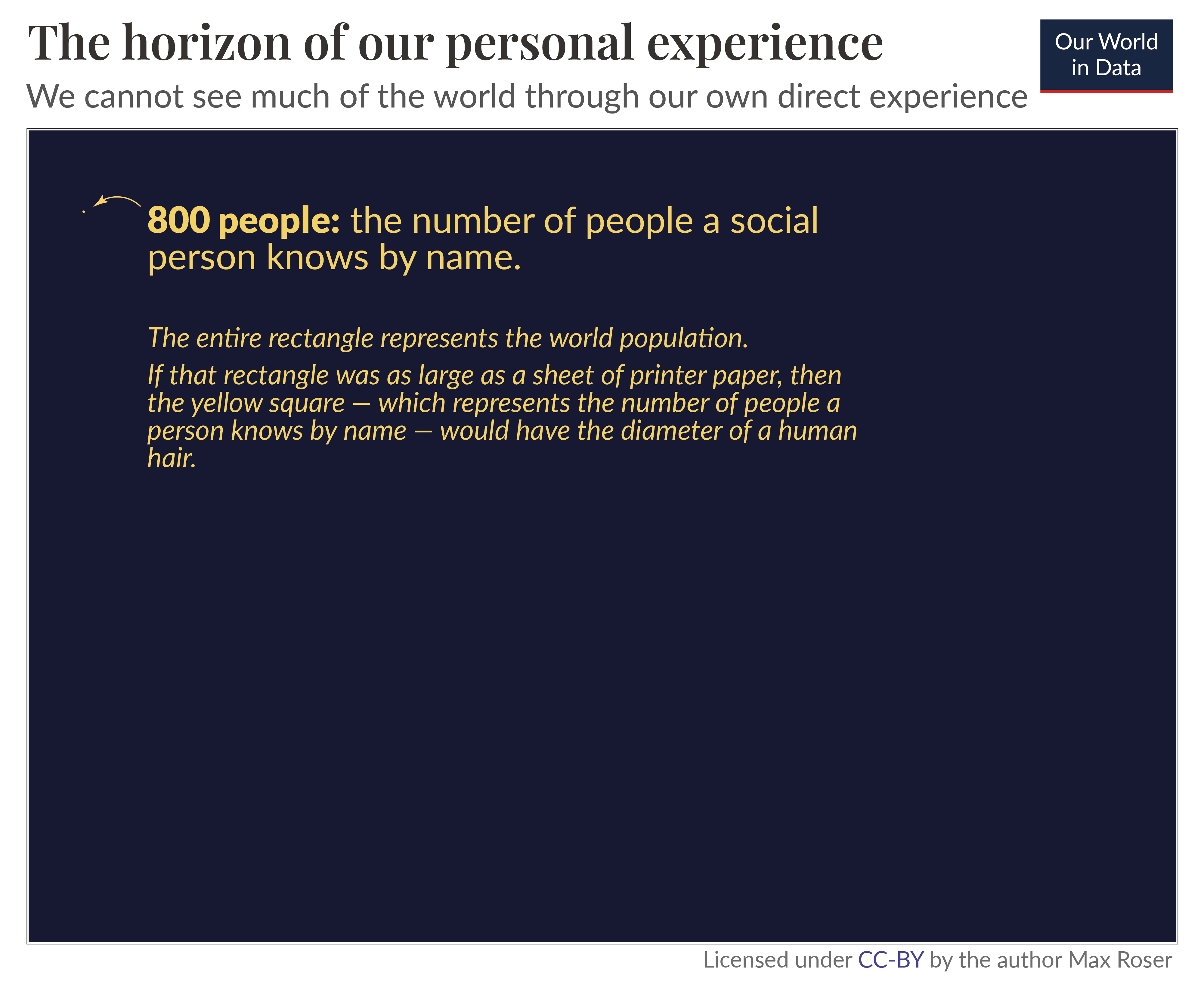
Let’s assume you are more social than the average American, and you know 800 people. In a world of 8 billion, this means that you know 0.00001% of the population. A 100,000th of a percent.2
It’s hard to visualize how small a fraction this is. If this illustration was drawn to scale, then the blue rectangle – which represents the world population – would be as large as a sheet of printer paper, while the yellow square – which represents the number that a person knows – would have the diameter of a human hair.3
This is why I’m very skeptical when people say things about “the world these days” based on what they hear from people they know.
We cannot see much of the world through our direct experience. The horizon of our personal experience is very narrow. For every person you know, there are ten million people you do not know.
And chances are that the people you know are quite similar to you, far from representative of the world — or your country — as a whole.
How wide can the horizon of our personal experience be?
Perhaps you think restricting the people you learn from to the number of people you know by name is too narrow. After all, you also learn from strangers you meet, even if you don’t get to know their names.
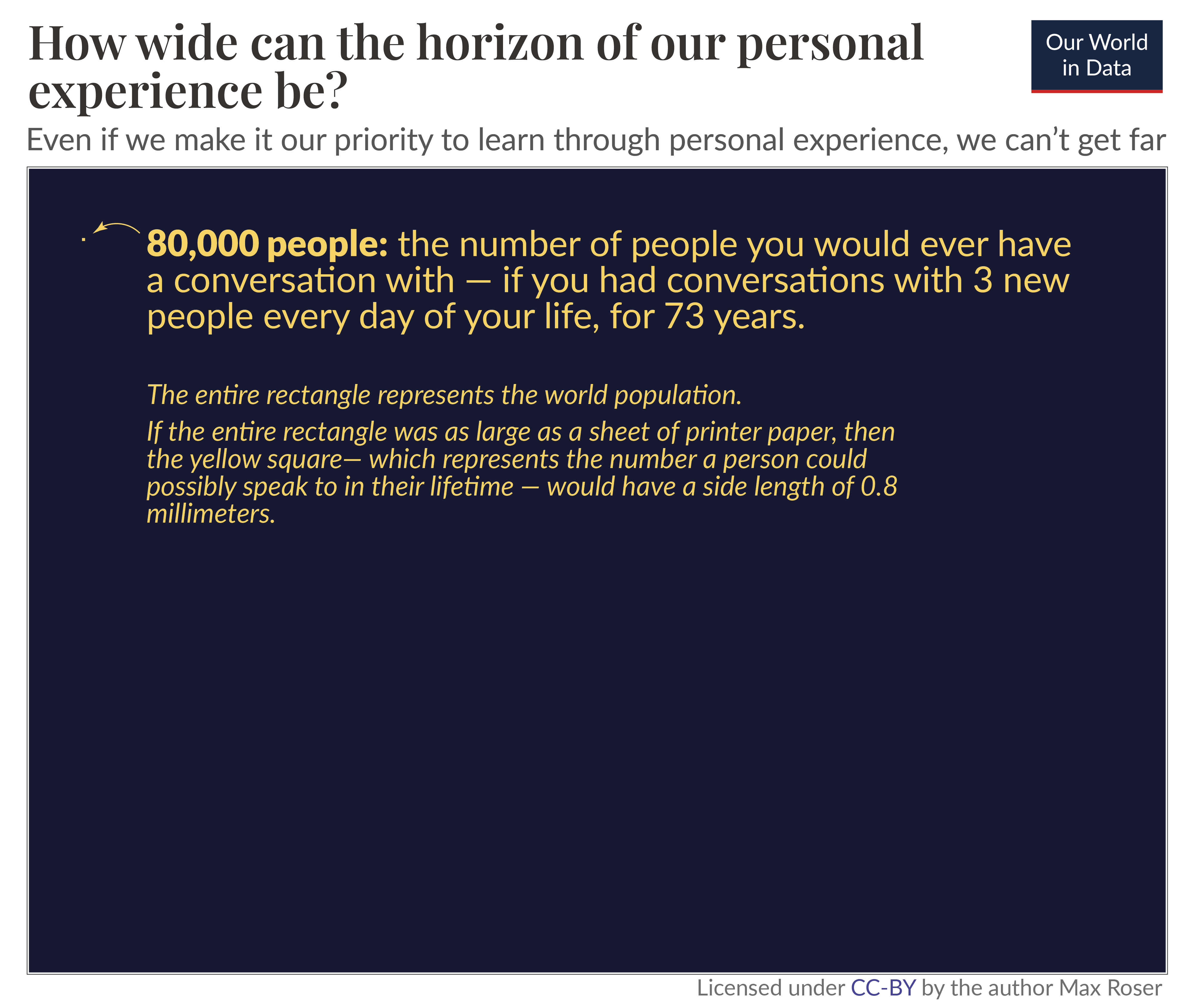
Let’s assume you are exceptionally good at this, and you have a conversation with three new people every single day of your life.
If you can keep this up for 73 years, you will get to know 80,000 people.4 That’s more than a hundred times the number of people you’d know by name.
This is still a tiny fraction of the world. After a lifetime of speaking with people, you will have spoken to 0.001% of the world’s population. For every person you’ve had a conversation with, there are still 100,000 people you’ve never spoken to.
Drawn to scale, the orange square, which represents the number of people you could ever speak to, would be less than a millimeter (0.8mm) wide.5
I am focusing on personal interaction as the most direct and in-depth way to learn about others, but they are not our only experience by which we learn about others. We also learn by seeing other peoples’ clothes, by seeing their houses, or by hearing others talk about their personal experiences. But while these experiences also help, they still don’t get us very far. The world is large, and even if you are exceptionally attentive and exceptionally good at making connections and speaking to people, it is simply impossible to see much of the world directly.
The fragmented perspective of the news media: some spotlights on particular people, but much of the world is left in darkness
The limits of our personal experience don’t reach far beyond ourselves. How can we know about the world if we want to see beyond this tight horizon?
In one way or another, we have to rely on the media. Whether it is television or radio, the newspaper or photography, books, podcasts, documentaries, research papers, statistical tables, or social media.
This fact is so obvious that it is easy to miss how important it is: everything you hear about anyone who is more than a few dozen meters away, you know through some form of media.
That’s why the media we choose to rely on is so important for our understanding of the world.
The news is the media that shapes our picture of the world more than any other. Today, it’s often intertwined with social media. It is valuable as it lets us see beyond our own tight horizon, but the view the news offers is a spotted and fragmented one.
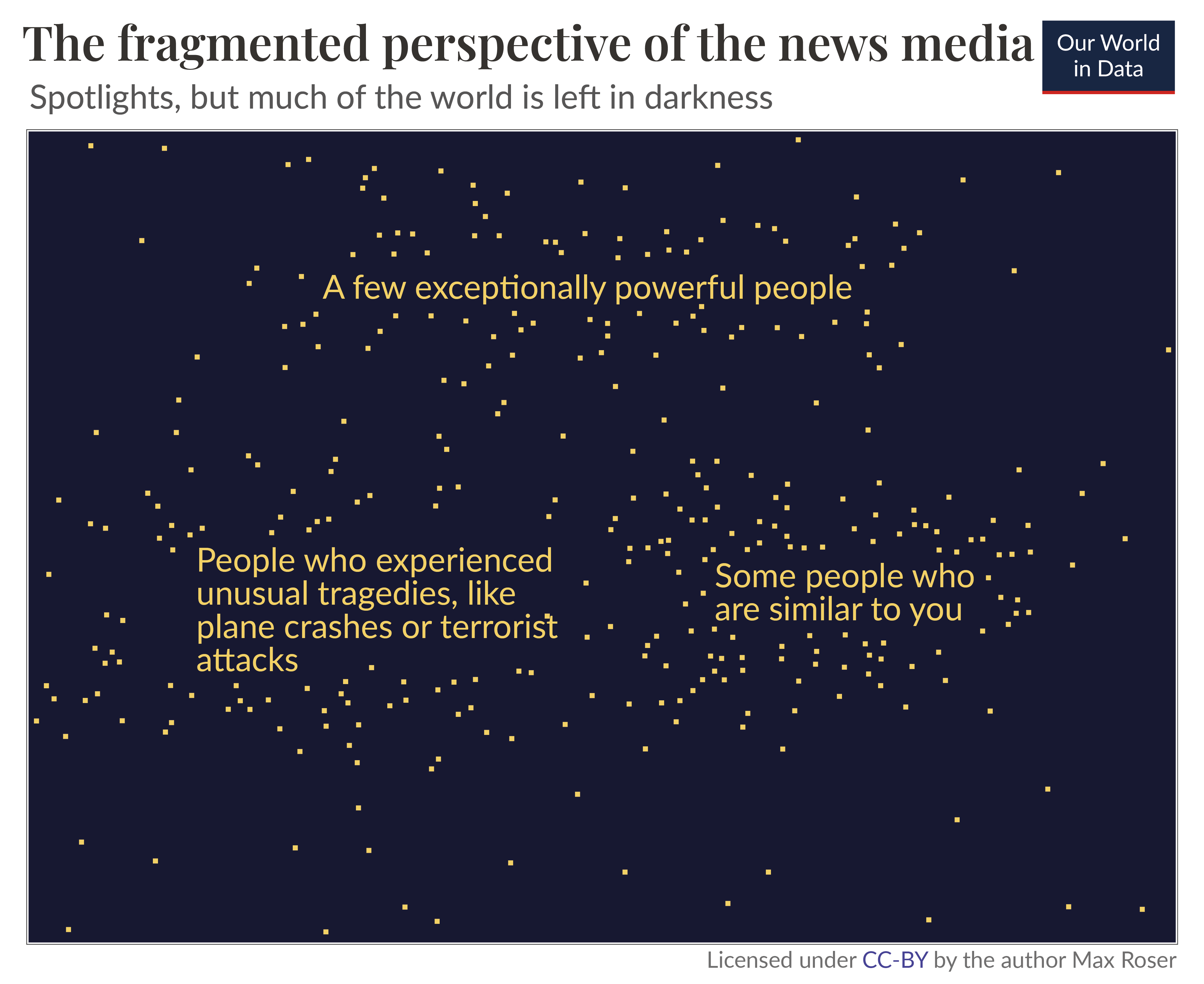
The news reports on the unusual things that happen on a particular day, but the things that happen every day never get mentioned. This gives us a biased and incomplete picture of the world; we are inundated with detailed news on terrorism but hardly ever hear of everyday tragedies like the fact that 16,000 children die every single day.
The illustration on the side visualizes this fragmented view. The news focuses on exceptionally powerful people or on those who experienced unusual tragedies. But while it puts the spotlight on those few people, it leaves most of the world in darkness.
The problem is not so much what the news media covers but what it does not cover. Those left in darkness are often poor and powerless and geographically far from us. What we see in the news is not nearly enough to understand the world we are living in.
What is missing: everyone else — for this, we need global data
Of course, it is challenging to hear about everyone. But that’s the challenge we have to take on if we don’t want to be left with a scattered and biased perspective of the world.
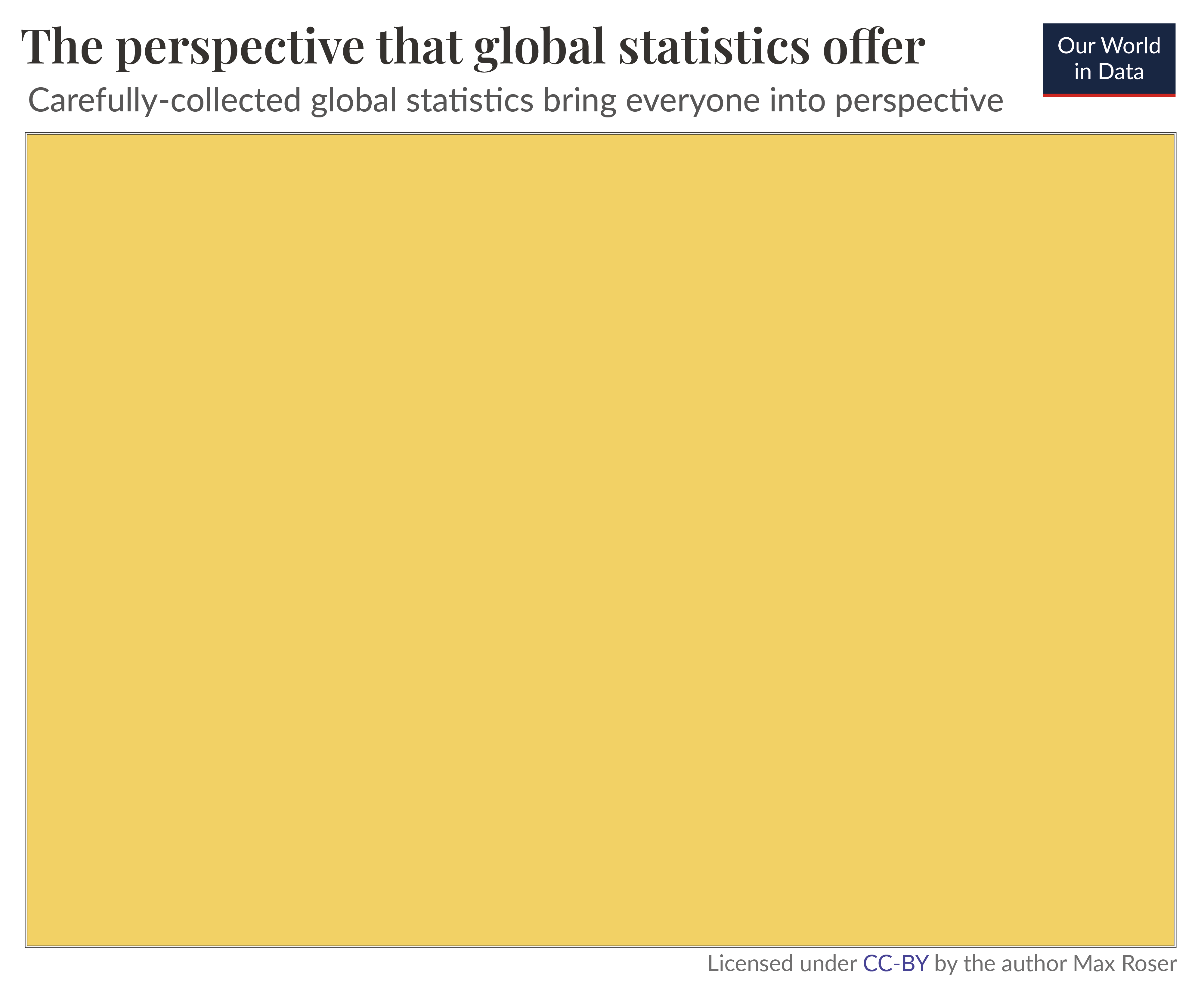
If we want to see what on earth is going on, we have to tell all the stories. This is possible. Telling many stories at once is statistics.
Statistical methods make it possible to draw reliable conclusions about a population as a whole. Statistics is an extraordinary cultural achievement that allows us to broaden our view, from the individual stories of those in the spotlight to a perspective that includes everyone.
Global economic data can tell us about the incomes of everyone on this planet. Global health data aim to tell us about everyone’s cause of death. And similarly, we can learn about everyone who lacks access to basic electricity, everyone who lacks access to clean drinking water, and everyone who lacks access to basic sanitation.
Global statistics don’t only allow us to see what the “world these days” looks like, but also how it has changed. Statistics that document how the world has changed are often very surprising to those who mostly rely on the news to understand the world. While the news focuses overwhelmingly on all the things that are going wrong, historical statistics allow us to also see what has gone right — the immense progress the world has achieved.
Statistics can illuminate the world in a way that our personal experiences and the news media can’t. This is why we, at Our World in Data, rely on global statistics to understand how the world is changing.
The visual illustrates what carefully-collected global statistics make possible: they illuminate the entire world around us, and allow us to see what is happening to everyone.
No data is perfect
The collection and production of good statistics is a major challenge. Data might be unrepresentative in some ways, it might be mismeasured, and some data might be missing entirely. Everyone who relies on statistics to form their worldview needs to be aware of these shortcomings.
Our goal here at Our World in Data is to present the best available data and at the same time highlight their shortcomings. The most important work is done by the statisticians who collect and publish the global databases in the first place. Our role is to make their work accessible and understandable. To achieve this goal we speak with experts, read the scientific literature, and analyze the available data so that we can highlight the best available statistics and highlight the shortcomings that even the best data is associated with.
A statistical understanding of the world needs to become much more central to our culture
I don’t want to suggest that it is a bad idea to rely on personal experience or the news to learn about the world. Each way of learning about the world has its value. It’s about how we bring them together: the in-depth understanding that only personal interaction can give us, the focus on the powerful and unusual that the news offers, and the statistical view that gives us the opportunity to see everyone.
We have many ways of learning about the world and we should make use of all of them. A statistical view without personal experience lacks depth, and personal experience without statistical knowledge lacks perspective.
The problem is that most of our focus goes toward personal experience and the news. They are held in high regard, while statistics are left to a small corner of our culture. This is not where they belong. A society that has the aspiration to care for everyone needs to bring a statistical understanding of the world into the center of its culture.
For this, we need to remember what statistical figures really mean. Spreadsheets are not just numbers, they tell us about the reality of the people around us and allow us to see what is happening to everyone, all at once.
How this relates to our mission: I’ve focused on our global understanding, but the same is true at smaller scales. To see what our own country, our own city, is like, we need statistics. These statistics exist, but they are often neither accessible nor understandable. They are buried in spreadsheets, hidden behind paywalls, and presented in academic jargon.
Our mission at Our World in Data is to change this and make the statistics that are needed to understand our society accessible and understandable for everyone. → Read more about our mission.
Acknowledgements: I would like to thank Hannah Ritchie, Natasha Ahuja, Ike Saunders, Edouard Mathieu, Esteban Ortiz-Ospina, and Bastian Herre for their helpful comments to drafts of this essay and the visualizations.
Endnotes
McCormick, T. H., Salganik, M. J., & Zheng, T. (2010). How many people do you know?: Efficiently estimating personal network size. Journal of the American Statistical Association, 105(489), 59–70. http://doi.org/10.1198/jasa.2009.ap08518. Online here https://www.ncbi.nlm.nih.gov/pmc/articles/PMC3666355/ and free at the website of Princeton Uni here. https://www.princeton.edu/~mjs3/mccormick_salganik_zheng10.pdf
The researchers arrive at their estimate by asking a representative sample of the American population how many people they know with a specific first name. By comparing the answers of respondents with the frequency with which those names occur in the population, they arrive at their estimate of how many people the respondent knows.
The number of people that Americans know is log-normally distributed with a mean network size of 611 and a median network size of 472.
800 / 8,000,000,000 *100 = 0.00001%
The diameter of human hair varies, ranging from 17 μm to 181 μm, according to Wikipedia. One nominal value often chosen is 75 μm.
In my calculation, I’m assuming that the diameter of the hair falls roughly in the middle of that range and has a diameter of 79 µm, and takes up a squared area of the size of 6237 μm².
If the hair was thinner or thicker, or if the hair was more tightly or more loosely packed, then the area which represents 800 people would accordingly be smaller or larger.
Standard printer paper varies between world regions (A4 is common in some parts, while in other parts, the letter format is more common). In the text, I am therefore referring to a sheet of printer paper.
In my calculation I am using A4 as the reference format for a sheet of printer paper, but the claim is similarly true for all A4-like-formats (like the ‘letter’ in the US). That’s because the ‘width of hair’ has quite a large plausible range, as we’ve just seen. So for a slightly thicker hair, you end up with a slightly larger page. (The main point is that the ratio between a page of printer paper and the diameter of a hair is roughly 10,000,000.)
Here is my calculation:
The ratio between 800 people and 8 billion people is 10,000,000.
An A4 page is 210mm x 297mm = 62,370 mm². This represents 8 billion people. A ten-millionth of this area therefore represents 800 people: 62,370 mm² /10,000,000 = 0.006237 mm² → converted to μm² (one-millionth of a square millimeter) is 6237 μm².
The square root of 6237 μm² is 78.97 μm, i.e. the width of a hair.
Check the calculation: 79 μm = 0.079mm is the diameter of one hair.
(210mm/0.079mm) x (297mm/0.079mm) = 9,993,591 = 10 million hairs fit into one A4 page.
Or directly: ((210mm/0.079mm) x (297mm/0.079mm)) x 800 = 7,994,872,617 → the number of people in the world
So if the rectangle was as large as an A4 page, then the square which represents the number of people you know would have the width of one hair.
——
Or another comparison: Claiming that you know about the world through personal contacts is like claiming that you know a movie after you’ve seen 6 millionths of one second of it.
A movie of 2 hours is (2*60*60*1,000,000=) 7,200,000,000 microseconds long. http://www.randalolson.com/2014/01/25/movies-arent-actually-much-longer-than-they-used-to-be/
0.00001% of 7,200,000 microseconds are [(800/8,000,000,000)*7,200,000,000=720 microseconds, which is 0.00072 seconds – i.e. less than a thousandth of a second.
According to Wikipedia, film frames these days are usually 1/24, 1/25 or 1/30 of a second long. The fastest frames (1/30) are therefore 45 times longer than 0.00072 seconds.
Only if you know 36,000 people (45-times more than 800) does the number of people you personally know represent a single frame of that movie.
Even knowing 131-times as many as the average person – 80,000 people – means that you only know 0.001% of the world population. That’s (80,000 / 8,000,000,000 *100) and not even a tenth of a second (less than 3 frames) of that 2 hour movie.
365.25*3*73 = 79,989.75 = ca. 80,000
And in reality, the fraction you would speak to is even smaller as the number of people alive during those 73 years would be higher than 8 billion people.
The calculation is 80,000 / 8,000,000,000 * 100 = 0.001%.
If 800 people are represented by a squared area with a base length of 79 micrometers, then the square that represents 80,000 people would be 100 times larger. This means it would be 10 times wider and 10 times higher: 790 micrometers by 790 micrometers.
790 micrometers are 0.79 millimeters.
Check of the calculation: (210mm/0.79mm)*(297mm/0.79mm)*80,000=7,994,872,617
Of a 2-hour movie it would not even be a tenth of a second (less than 3 frames).
Cite this work
Our articles and data visualizations rely on work from many different people and organizations. When citing this article, please also cite the underlying data sources. This article can be cited as:
Max Roser (2023) - "The limits of our personal experience and the value of statistics". Published online at OurWorldInData.org. Retrieved from: 'https://staging-owid.netlify.app/limits-personal-experience' [Online Resource]BibTeX citation
@article{owid-limits-personal-experience,
    author = {Max Roser},
    title = {The limits of our personal experience and the value of statistics},
    journal = {Our World in Data},
    year = {2023},
    note = {https://staging-owid.netlify.app/limits-personal-experience}
}
Reuse this work freely
All visualizations, data, and code produced by Our World in Data are completely open access under the Creative Commons BY license. You have the permission to use, distribute, and reproduce these in any medium, provided the source and authors are credited.
The data produced by third parties and made available by Our World in Data is subject to the license terms from the original third-party authors. We will always indicate the original source of the data in our documentation, so you should always check the license of any such third-party data before use and redistribution.
All of our charts can be embedded in any site.

