How has inequality in the United Kingdom changed over the long run?
Historical and contemporary sources can provide us with a picture of inequality in the UK over the last 700 years.
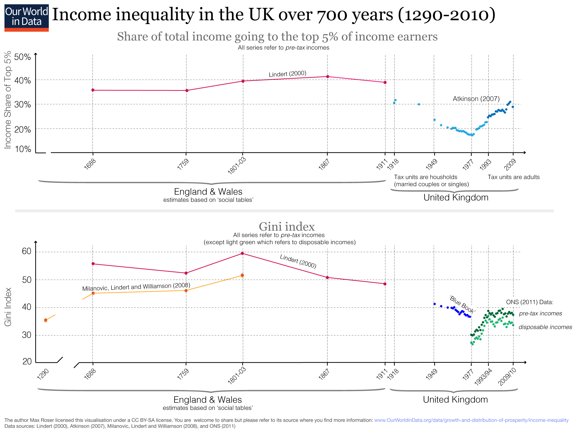
The United Kingdom is the country for which we have the best information on the distribution of income over the very long run. This information is visualized in the chart below. The top panel shows the share of total income going to the top 5% of income earners, and the bottom panel shows the Gini coefficient.
The early estimates are based on “social tables” — studies providing estimates of the average incomes of different social classes at a particular time.
As with most estimates from the distant past, there is some concern about how accurate these estimates are. For example, Holmes (1977) published a detailed critique of one of the most famous tables: Gregory King's Social Table for England in 1688. Holmes showed King's limitations as a social analyst and criticized his social table, arguing that various biases "beguiled him (1) into underestimating the number of families in some of the wealthiest, and fiscally most productive classes; and (2) into underestimating (sometimes grossly) income levels at many rungs above the poverty line."1
However, there are ways to consider these biases, and the estimates shown in the graph are based on a revision of King's original estimates conducted by Lindert and Williamson. The authors say that they use "Holmes’ penetrating critique (1977) to guide our modification of King’s tables".2
The estimates presented in this visualization suggest that inequality in the UK was very high in the past and did not change much until the onset of industrialization. As we can see, incomes used to be remarkably concentrated: up to 40% of total income went into the pockets of the wealthiest 5%.
Starting in the late 19th century, income inequality decreased dramatically and reached historic lows in the late 1970s. However, during the 1980s, inequality increased substantially in the UK, and the Gini and the top income share increased sharply.
From the early 1990s onwards, the UK experienced a divergence between the Gini coefficient and the top income shares. The Gini remained broadly flat over these two decades. This tells us that inequality across the bulk of the distribution has not increased further in the UK.
At the very top, the evidence shows a different story. We observe that income growth at the very, very top of the income distribution has outstripped the strong growth of incomes across the rest of the distribution.3
More than 700 years of income inequality in the UK measured via income share of the top 5% and Gini, 1980-20104

Endnotes
The publication is G. S. Holmes (1977) – Gregory King and the Social Structure of Pre-Industrial England. Transactions of the Royal Historical Society, Fifth Series, Vol. 27 (1977), pp. 41-68. Online here.
This publication is Lindert, Peter H. and Williamson, Jeffrey G (1982) – Revising England's social tables 1688-1812. Explorations in Economic History. Volume 19, Issue 4, October 1982, Pages 385–408. Online here.
Stephen Jenkins has tried to harmonize the empirical findings in the recent publication Jenkins, Stephen P. (2016) Pareto models, top incomes, and recent trends in UK income inequality. Economica. ISSN 0013-0427.
The sources for this graph are shown in the plot and refer to:
- Peter H. Lindert (2000) – Three centuries of inequality in Britain and America. In A. B. Atkinson & F. Bourguignon (Eds.), Handbook of Income Distribution. Amsterdam: Elsevier. Until 1801-3, referring to England and Wales. After 1867 referring to the UK.
- Atkinson, Anthony B. (2007) – 'The Distribution of Top Incomes in the United Kingdom 1908-2000' in Atkinson, A. B. and Piketty, T. (editors) Top Incomes over the Twentieth Century. A Contrast Between Continental European and English-Speaking Countries, Oxford University Press, chapter 4. I have taken this data from the World Top Income Database. The series was updated by the same author since its publication in 2007.
- Milanovic, Lindert, and Williamson (2008) – Ancient Inequality. In The Economic Journal. Volume 121, Issue 551, pages 255–272, March 2011. (The authors are relying on various Social Tables. Among others, the one by King shown above.)
- UK Blue Book inequality before taxes is also taken from Lindert (2000) [see above].
- ONS (2011) refers to the following Office for National Statistics publication: Andrew Barnard, Steve Howell, and Robert Smith (2011) – The effects of taxes and benefits on household income, 2009/10. Further analysis and methodology. Online here.
Cite this work
Our articles and data visualizations rely on work from many different people and organizations. When citing this article, please also cite the underlying data sources. This article can be cited as:
Max Roser (2013) - "How has inequality in the United Kingdom changed over the long run?". Published online at OurWorldInData.org. Retrieved from: 'https://staging-owid.netlify.app/how-has-inequality-in-the-uk-changed-over-the-very-long-run' [Online Resource]BibTeX citation
@article{owid-how-has-inequality-in-the-uk-changed-over-the-very-long-run,
    author = {Max Roser},
    title = {How has inequality in the United Kingdom changed over the long run?},
    journal = {Our World in Data},
    year = {2013},
    note = {https://staging-owid.netlify.app/how-has-inequality-in-the-uk-changed-over-the-very-long-run}
}
Reuse this work freely
All visualizations, data, and code produced by Our World in Data are completely open access under the Creative Commons BY license. You have the permission to use, distribute, and reproduce these in any medium, provided the source and authors are credited.
The data produced by third parties and made available by Our World in Data is subject to the license terms from the original third-party authors. We will always indicate the original source of the data in our documentation, so you should always check the license of any such third-party data before use and redistribution.
All of our charts can be embedded in any site.

