Demographic transition: Why is rapid population growth a temporary phenomenon?
Death rates fall first, then fertility rates, and this leads to a slowdown of population growth.
Population growth is determined by births and deaths. Every country has seen very substantial changes in both: mortality and fertility rates have fallen across the world.
But declining mortality rates and declining fertility rates alone do not explain why populations grow. If these changes happened at the same time, the size of the population would not increase. What is crucial is the timing at which mortality and fertility changes.
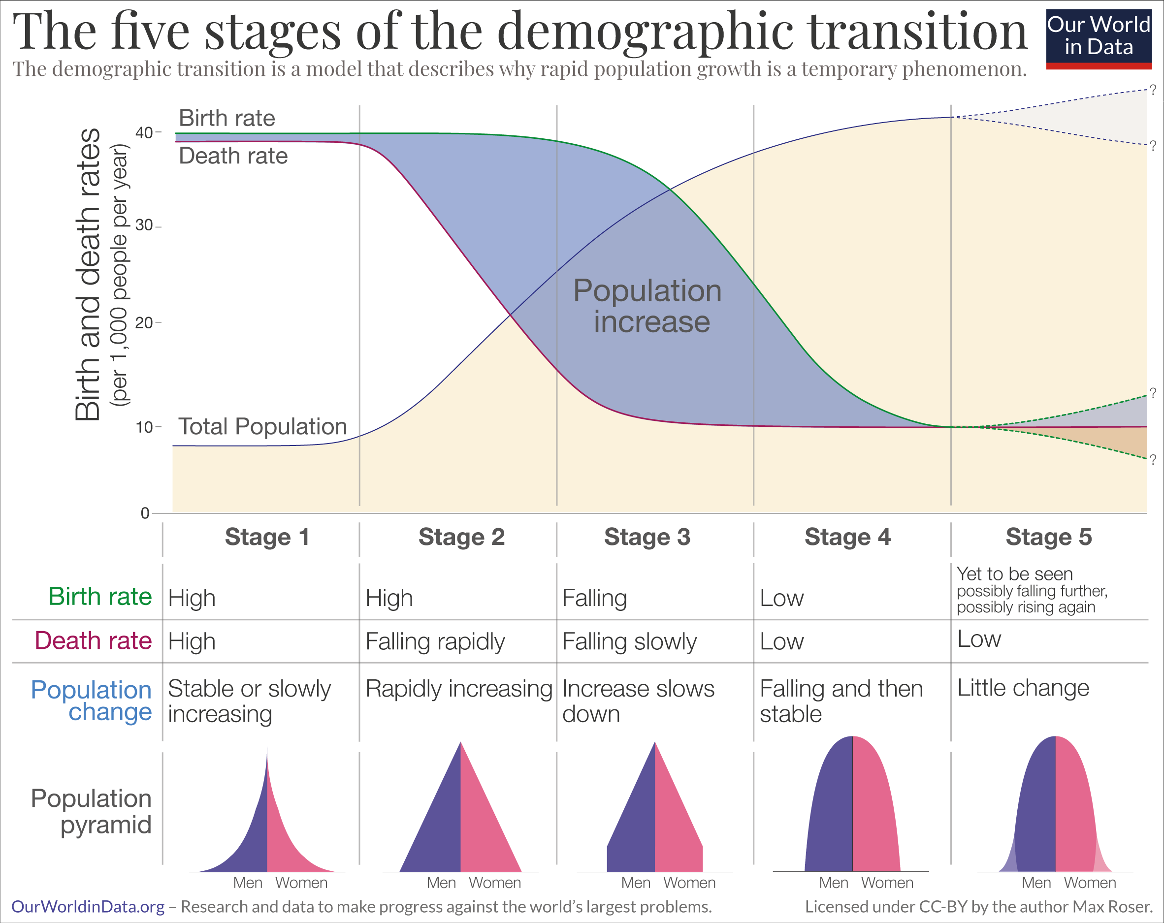
The model that explains why countries go through a period of rapid population growth is called the ‘demographic transition’. It is shown in the schematic figure. It is a beautifully simple model that describes the observed pattern in countries around the world and is one of the great insights of demography.1
As the graphic below shows, the demographic transition is a sequence of five stages:
- Stage 1 – high mortality and high birth rates: In the past birth rates were high, but since the mortality rates were also high we observe no or only very small population growth. This describes the reality through most of our history. Societies around the world remained in stage 1 for many millennia as the long-run data on extremely slow population growth makes clear. At this stage the population pyramid is broad at the base as many children are born. But since the mortality rate is high across all ages – and in particular for children – the pyramid gets much narrower towards the top.
- Stage 2 – mortality falls, but birth rates are still high: In the second phase the health of the population slowly starts to improve and the mortality rate starts to fall. Since the health of the population has already improved, but fertility still remains as high as before, this is the stage of the transition at which the size of the population starts to grow rapidly. Historically it is the exceptional time at which the extended family with many (surviving) children is common.
- Stage 3 – mortality is low and birth rates begin to fall: At this stage the birth rate starts to fall and as a consequence the rate at which the population grows begins to decline as well. In our topic page on fertility rates we discuss in detail why fertility rates declined. But to summarize the main points: When the mortality of children is not as high as it once was, parents adapt to the healthier environment and choose to have fewer children; the economy is undergoing structural changes that makes children less economically valuable; and as women gain more power within society and within partnerships they tend on average to have fewer children than before.
- Stage 4 – mortality and birth rates are low: Rapid population growth comes to an end in stage 4. At this stage the birth rate falls to a similar level as the already low mortality rate. The population pyramid is now box shaped; as the mortality rate at young ages is now very low the younger cohorts are now very similar in size and only at an old age the size of cohorts get smaller rapidly.
- Stage 5 – the future of population growth will be determined by what is happening to fertility rates: The demographic transition describes changes over the course of socio-economic modernization. What happens at a very high level of development is not a question we can answer with certainty since only few societies have reached this stage. If fertility rates are rising again at very high levels of development — as the research by demographers Mikko Myrskylä, Hans-Peter Kohler, and Francesco Billari suggests — then population sizes might stabilize or even increase. However if the fertility rate stays below 2 children per woman then we will see a decline of the population size in the long run.

Empirical evidence for the demographic transition
Rapid population growth is a temporary phenomenon
If fertility fell in lockstep with mortality we would not have seen an increase in the population at all. The demographic transition works through the asynchronous timing of the two fundamental demographic changes: The decline in the death rate is followed by the decline in birth rates.
This decline in the death rate followed by a decline in the birth rate is something we observe with great regularity and is largely independent of the culture or religion of the population.
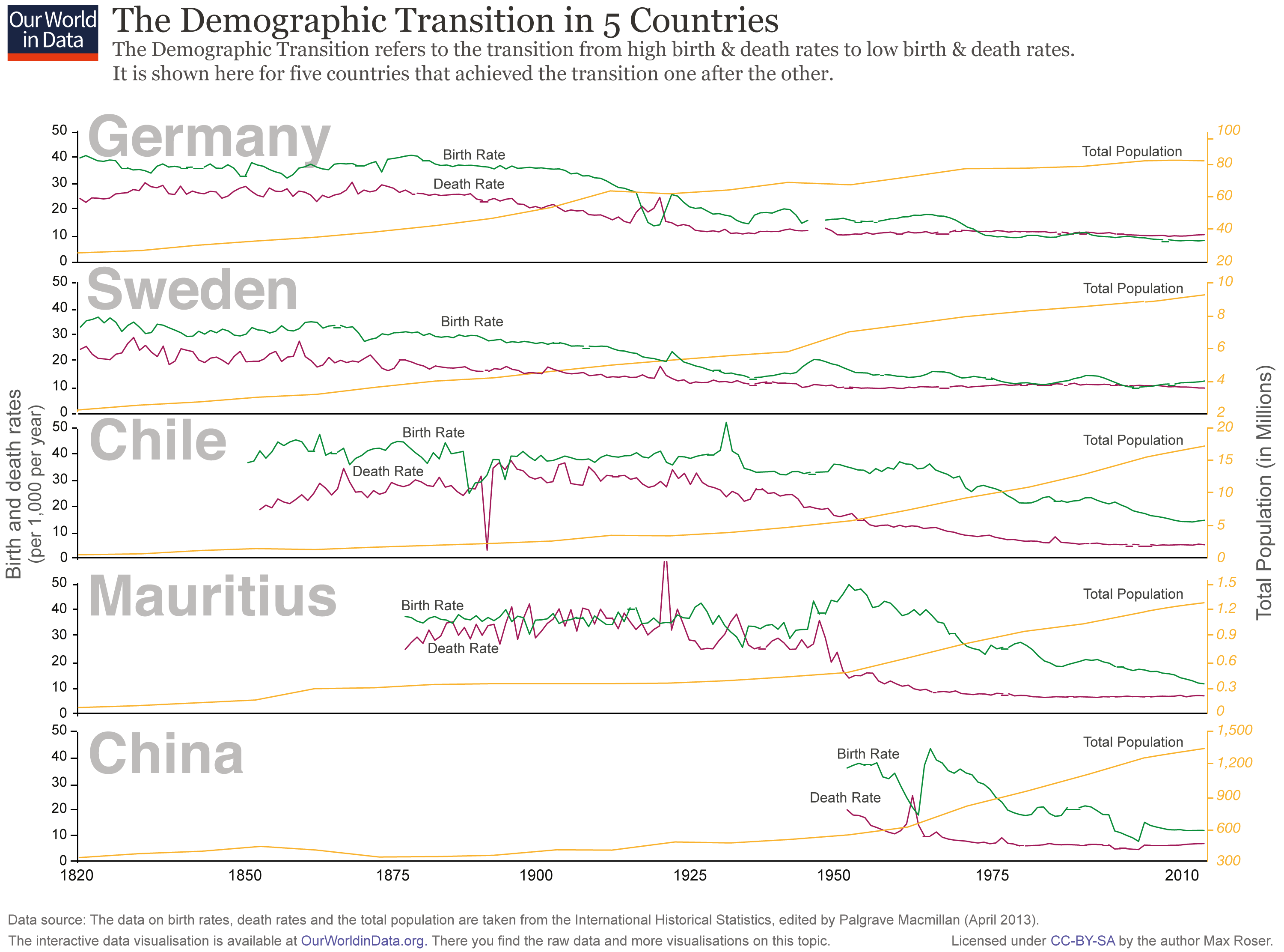
The chart presents the empirical evidence for the demographic transition for five very different countries in Europe, Latin America, Africa, and Asia. In all countries, we observed the pattern described by the demographic transition, first a decline in mortality that starts the population boom and then a decline in fertility which brings the population boom to an end. The population boom is a temporary event.
In the past, the size of the population was stagnant because of high mortality. Now country after country are moving into a world in which the population is stagnant because of low fertility.

England and Wales’s demographic transition
Perhaps the longest available view of the demographic transition comes from data for England and Wales.
In 1981, Anthony Wrigley and Roger Schofield published a major research project analyzing English parish registers—a unique source that allowed them to trace demographic changes for the three centuries prior to state records.2
According to the researchers, “England is exceptionally fortunate in having several thousand parish registers that begin before 1600”; collectively, with their early start and breadth of coverage, these registers form an excellent resource. As far as we know, there is no comparable data for any other country over such a long period.
The chart shows the birth and death rates in England and Wales over the span of nearly 500 years. It stitches together Wrigley and Schofield’s data for the years from 1541 to 1861 with two other sources up to 2015.
As we can see, a growing gap opens up between the birth and death rate after 1750. During this period the population begins to increase rapidly in size. Around the 1870s, we begin to see the third stage of the demographic transition. As the birth rate starts to follow the death rate’s decline, that gap between the two starts to shrink, slowing down the rate of population growth.
Sweden’s demographic transition
In the next visualization we take a closer look at Sweden’s demographic transition. The country’s long history of population recordkeeping – starting in 1749 with their original statistical office, ‘the Tabellverket’ (Office of Tables) – makes it a particularly interesting case study of the mechanisms driving population change.
Statistics Sweden, the successor of the Tabellverket, has published data on both deaths and births since record keeping began more than 250 years ago. These records suggest that around the year 1800, the Swedish death rate started falling, mainly due to improvements in health and living standards, especially for children.3
Yet while death rates were falling, birth rates remained at a constant pre-modern level until the 1860s. During this period and up until the first half of the 20th century, there was a sustained gap between the frequency of deaths and the frequency of births. It was because of this gap that the Swedish population increased.
Demographic transitions across the world
Today, different countries find themselves in different stages of the demographic transition. In the chart we see birth rates plotted against death rates: the two variables that determine the demographic transition.
Most high-income countries have reached stage four and have low birth and death rates.
Endnotes
For a history and literature review of the theory’s development, see: Kirk, Dudley. “Demographic transition theory.” Population studies 50.3 (1996): 361-387.
Wrigley, E. A., Schofield, R. S., & Schofield, R. (1989). The population history of England 1541-1871. Cambridge University Press.
Before 1800 more than 20% of Swedish babies died before they reached their first birthday, and of those who survived, another 20% died before their 10th birthday (see Croix, Lindh, and Malmberg (2009), Demographic change and economic growth in Sweden: 1750–2050. In Journal of Macroeconomics, 31, 1, 132–148).
Cite this work
Our articles and data visualizations rely on work from many different people and organizations. When citing this article, please also cite the underlying data sources. This article can be cited as:
Max Roser (2023) - "Demographic transition: Why is rapid population growth a temporary phenomenon?". Published online at OurWorldInData.org. Retrieved from: 'https://staging-owid.netlify.app/demographic-transition' [Online Resource]BibTeX citation
@article{owid-demographic-transition,
    author = {Max Roser},
    title = {Demographic transition: Why is rapid population growth a temporary phenomenon?},
    journal = {Our World in Data},
    year = {2023},
    note = {https://staging-owid.netlify.app/demographic-transition}
}
Reuse this work freely
All visualizations, data, and code produced by Our World in Data are completely open access under the Creative Commons BY license. You have the permission to use, distribute, and reproduce these in any medium, provided the source and authors are credited.
The data produced by third parties and made available by Our World in Data is subject to the license terms from the original third-party authors. We will always indicate the original source of the data in our documentation, so you should always check the license of any such third-party data before use and redistribution.
All of our charts can be embedded in any site.

