The collection, dissemination and use of good data on testing is a key part of the global response to the pandemic.1
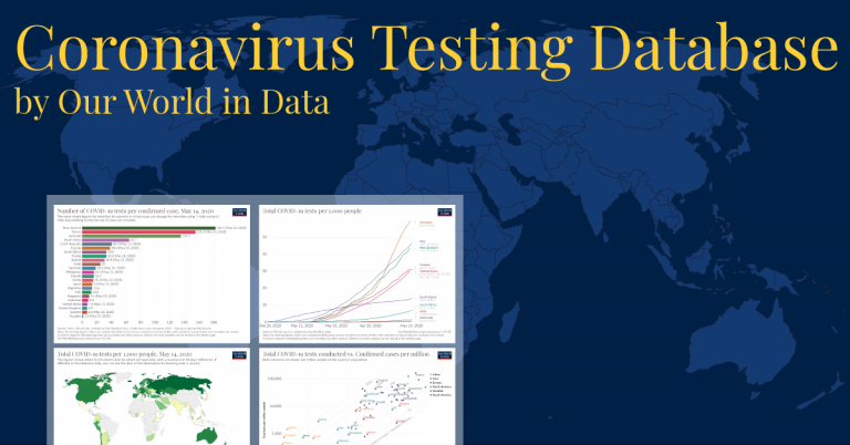
To track this vital data, we at Our World in Data have built and maintained the COVID-19 Testing Dataset. This collates official data on the number of tests performed, as published by different countries through a variety of official channels, including health ministry websites, press releases, and official social media accounts. This dataset is in high demand, and it is relied upon by many citizens, journalists, and health researchers around the world.2 The UN, the World Bank, and many governments around the world also rely on our database.
To enable the best use of this crucial data on testing, however, countries need to publish it in a clear and accessible way.
Here we provide a number of recommendations for good reporting practice based on our experience of collecting, presenting and interpreting testing data published by more than 80 countries.
As highlighted in criticisms made by the UK Statistics Authority this week, the UK is one example where testing data is not being published in a way that allows the public or epidemiologists to understand exactly what level of testing is happening. Unfortunately the UK is not alone in this respect: Many countries are publishing their testing data in a way that significantly limits its value.
Other countries however report their data very well, and set an example that could be easily followed by others.
These differences in how countries report their testing data have real consequences. Our understanding of testing in different countries across the world, and hence our understanding of the pandemic itself, is less complete than it might be if reporting practices were improved.
The following guidelines aim to help official providers of testing data publish it in the most useful way.
We outline two broad areas for improvement:
- Improving access to the available data;
- Improving the documentation of published data.
The recommendations outlined below – many of them quite straightforward – are already followed by many health authorities in both high- and low-income countries. If those good practices can be followed by all countries, then citizens, policymakers and researchers will be in much better position to fully utilize the available testing data and put it to work in understanding, and ultimately combatting, the pandemic.
Best practices for data access
We suggest that national authorities adapt the way they report data according to the following guidelines:
1. Make the data public
Up-to-date figures should always be released publicly, rather than sent to international organizations or institutions such as Our World in Data privately (such as by email).
2. Publish in a consistent location
For the data to be findable and collected promptly, the national authority should always release it in the same location (such as a COVID-19 dedicated website, a Ministry of Health press release section, etc.).
3. Use a machine-readable format
The data should be published in a spreadsheet of machine-readable formats such as CSV, JSON, XLSX, or ODS. Less useful, but acceptable is an HTML table. Countries should avoid publishing their data as text (with the relevant figure in the middle of a paragraph) or in PDF files.
4. Make the data available at a stable URL
Data published behind changing URLs (URLs that include timestamps, changing random IDs, etc.) or single-use blob URLs mean that data collection cannot be done easily and automatically. Instead, the data should be accessible behind a stable and public URL (e.g. https://xxxxx.xx/covid-testing/data.csv)
5. Update the full time series
Rather than a daily snapshot of the cumulative total number of tests done since the start of the outbreak, the data should be a full time series that is updated daily with a new row for the day.
6. Follow typical guidelines for data publication
The published data should follow the typical conventions of data storage, such as ISO 8601 for dates, snake case for column names, UTF-8 encoding, etc.
7. Provide detailed data
Headline aggregate figures should be complemented, where available, by breakdowns in terms of age group, region, or the testing process employed.
Belgium, an example of good practice on access
Belgium is a good example of a country that follows all of these guidelines:
- The Belgian institute for health, makes the data available on a public website.
- The data has been published consistently on that page since the start of the outbreak.
- All variables are available in CSV and JSON formats.
- The files are accessible at stable and public URLs.
- Each file contains the full time series with all data points since the outbreak started.
- Dates and variable names are in a consistent and easy-to-process format.
Best practices for data documentation
Data on testing cannot be used well without an understanding of what the published figures actually mean. A number, in the absence of a description, tells us nothing.
This is all the more important given differences across countries in the way testing data is collected, aggregated and presented. In different countries figures may relate to the number of people tested or the number of tests performed; they may include or exclude tests pending results; achieve different degrees of coverage in terms of reporting labs or regions; reflect different time periods; and so on.
This reduces the comparability of published figures across countries and over time, limiting what we are able to learn from the available testing data about the pandemic.
It is a problem that cannot be entirely solved. Some cross-country differences in the way testing data gets reported are a consequence of the different underlying approaches to testing that have been adopted. Moreover, they are somewhat inevitable in the absence of any international coordination or centralized collection of testing data.
But individual countries can do much to help improve the situation, simply by describing the data they publish with clearly-written, detailed documentation.
Where differences between countries’ data are understood, any issues with comparability can be more accurately and reliably identified and assessed, greatly mitigating the problem.
The following checklist gives an indication of the details needed for users of published testing data to properly interpret published testing data and compare across countries.
This information should be made available at an easy-to-find location alongside the data.
1. Which units are being counted?
It must be clear whether figures refer to the number of people tested, or the number of tests performed. Where possible, providing both figures, clearly labelled can be very useful for aiding cross-country comparisons.
2. Which testing technologies figures relate to?
It is essential that figures for different testing technologies should be provided separately, and are clearly and unambiguously labelled (whether PCR, antibody, other types of antigen testing).
3. Are negative results included? Are pending results included?
As well as positive tests, data should include counts of negative test results. The units in each case (whether people tested or the number of tests) should be clear, and they should be consistent across positive and negative outcomes.
Figures for tests pending results should be reported separately. If, however, they are included in an aggregate figure, this should be made explicit. Many sources report the number of individuals who are ‘suspected’ or have been ‘ruled out’. To be reliably included in test counts, it needs to be explicit whether such categories reflect the number of people who are awaiting test results or have tested negatively.
Test kits that have only been dispatched and not yet used should be reported separately from tests with, or pending, results.
4. Do the figures include all tests conducted in the country, or only some?
Figures reported by countries may only be partial if not all laboratories are reporting to the central authority. The scope of testing data should be made explicit by the source.
5. Are all regions and laboratories within a country submitting data on the same basis?
Answers to the questions above may vary from region to region. In order to assess the reliability of aggregate testing data, it needs to be clear if heterogeneous data is being summed together.
6. What period do the published figures refer to?
It should be clear whether figures relate to the date on which samples were taken, processed, or reported.
Cumulative counts of the total number of tests should also make clear the date from which the count begins.
Because the reporting of tests can take several days, for some countries figures for the last few days may not yet be complete. It needs to be made clear by the source if this may be the case.
7. Are there any issues that affect the comparability of the data over time?
To consider how testing figures are changing over time, it needs to be understood how any of the factors discussed above may have changed too.
8. What are the typical testing practices in the country?
Having a sense of how often and when individuals are tested, can help the users of these statistics understand how estimates of tests performed and individuals tested might relate to each other.
For instance, how many tests does a case investigation require? What are the eligibility criteria to be tested? Are health workers, or other specific groups, being routinely retested?
About Our World in Data
Our World in Data is a collaborative effort between researchers at the University of Oxford, based at the Oxford Martin Programme on Global Development, and the non-profit organization Global Change Data Lab.
Our data and writing on COVID-19 testing can be found at: ourworldindata.org/coronavirus-testing.
Further enquiries concerning the Our World in Data COVID-19 Testing Dataset, or good reporting practices, may be made to Joe Hasell, at joe@ourworldindata.org.


