Causes of death globally: what do people die from?
To make progress towards a healthier world we need to have a good understanding of what health problems we face today.
This post discusses data for 2019, the year before the pandemic started. Once global data for the period during the pandemic becomes available via the IHME, you can find it in our entry on the causes of death.
To make progress towards a healthier world we need to have a good understanding of what health problems we face today. What do people die from?

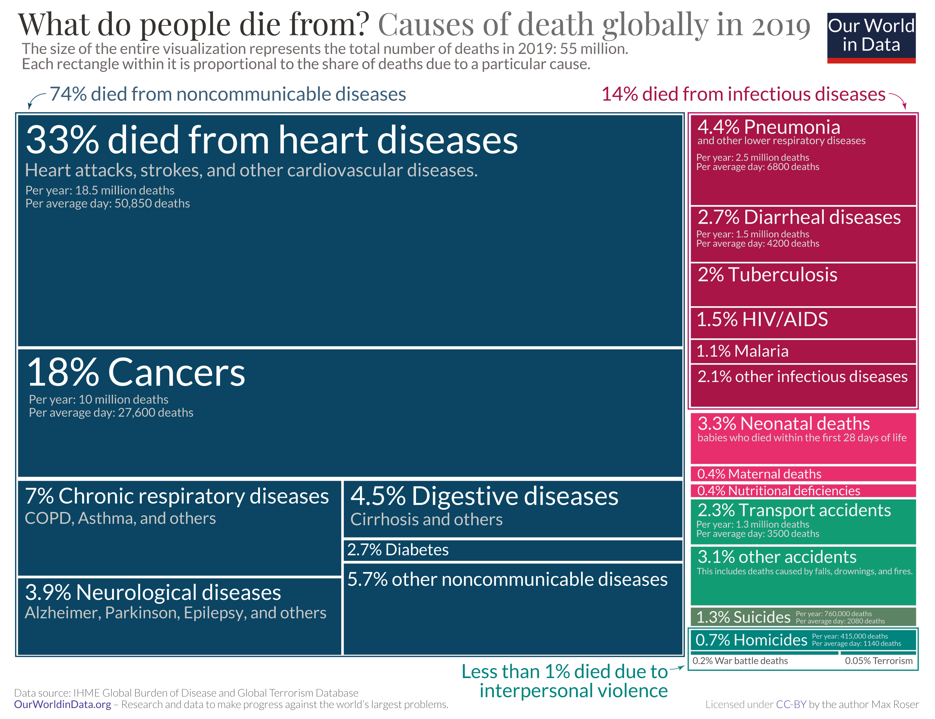
This visualization gives us the answer. This type of visualization is called a ‘tree map’. The size of the entire visualization represents the total number of deaths in 2019: that’s 55 million deaths. Each rectangle within it represents one cause of death: its size is proportional to the share of deaths from that particular cause. For example, 18% of global deaths in 2019 were from cancers; the rectangle representing cancers therefore corresponds to 18% of the total area. This way we can quickly see which causes kill many people, and which kill few.
The chart does not show the current situation. It shows the data for the year before the pandemic. During the pandemic the number and causes of deaths have changed. For 2020 it is estimated that 5.7 million people died from COVID and the current 2021 death toll – before the year is even over – is estimated to be 11.5 million.1 Other causes of death declined during the pandemic. We would expect, for example, that traffic deaths would decline when restrictions were in place and travel was reduced.
What the pre-pandemic data does provide is a perspective for where global health could get back to once the pandemic retreats.
In everyday language we sometimes say that a person died of ‘old age’ or that they ‘died of natural causes’. But there is always an underlying cause that stopped their body from functioning. It is these specific causes that are visualized in this chart. When the cause of death is not recorded then researchers rely on models to estimate the cause.
Epidemiologists group the causes of deaths into three large categories:
- Shown in blue on the left are non-communicable diseases; diseases which cannot be passed from person to person. The two most common causes of death fall into this group: cancers kill 18% of people and cardiovascular diseases – such as stroke and ischemic heart disease – are responsible for one-in-three deaths in the world.
- Shown in red are communicable or infectious diseases; diseases that are caused by a pathogen which can be passed from person to person.
- In green you see injuries. This is a very wide category which includes accidents – such as car crashes and falls from stairs or ladders – as well as intentional injuries like homicides, war deaths, and suicides.
What the world dies from is not what is reflected in the media. Some major causes of deaths receive very little attention. Very rare tragedies draw outsized attention – have a look at the bracket in the bottom right, there you see the small rectangle that refers to the deaths due to terrorism.
Violence is, fortunately, a relatively rare cause of death. While it receives a lot of media attention, more people die from diarrheal disease than from all forms of violence put together.2
This is the perspective we need if we want to contribute to progress against the world’s largest problems. We need a good sense of the relative importance of different causes of death and we need to focus our efforts on the biggest rectangles in this visualization. If we don’t look at the data it is easy to miss that preventing deaths from diarrhea would save more lives than bringing an end to all violence. The former should be much easier to achieve, too. We already know how to do it.
Endnotes
This is the estimate of the total death count from COVID according to the model produced by The Economist – which is very transparently documented by the team that produces it. This estimate is more than twice as high as the number of confirmed deaths which did not reach 2 million in 2020.
1.238 million people died from ‘intentional injuries’ in 2019:
760,000 Suicides
415,000 Homicides
63,000 Conflict and terrorism
Diarrheal diseases: 1.53 million
Cite this work
Our articles and data visualizations rely on work from many different people and organizations. When citing this article, please also cite the underlying data sources. This article can be cited as:
Max Roser (2021) - "Causes of death globally: what do people die from?". Published online at OurWorldInData.org. Retrieved from: 'https://staging-owid.netlify.app/causes-of-death-treemap' [Online Resource]BibTeX citation
@article{owid-causes-of-death-treemap,
    author = {Max Roser},
    title = {Causes of death globally: what do people die from?},
    journal = {Our World in Data},
    year = {2021},
    note = {https://staging-owid.netlify.app/causes-of-death-treemap}
}
Reuse this work freely
All visualizations, data, and code produced by Our World in Data are completely open access under the Creative Commons BY license. You have the permission to use, distribute, and reproduce these in any medium, provided the source and authors are credited.
The data produced by third parties and made available by Our World in Data is subject to the license terms from the original third-party authors. We will always indicate the original source of the data in our documentation, so you should always check the license of any such third-party data before use and redistribution.
All of our charts can be embedded in any site.

